REVIEW: Lazarus Risen #1, same fantastic comic, new deeper format

Lazarus Risen #1 is out 3/20/2019.

By Zack Quaintance — I really don’t think it’s possible to heap enough praise atop writer Greg Rucka and artist Michael Lark’s immersive dystopian near-future comic epic, Lazarus. I recently re-read the entire series, and once I got about mid-way through the second volume, I almost literally could not put it down. The world is so well-built, the characters compelling and complex, the dilemmas they face suspenseful. All in all, this is one of the smartest and most compulsively readable comics on the market, a must-read for any fan of the medium.

To date, there have been 28 issues of Lazarus in the main series, plus a six-issue auxiliary series titled Lazarus: X+66, which fills in the gaps of side characters and the story’s broader world over the course of a 12-month period. All told, that’s about 34 incredible issues of content, plus some other supplemental material with more information that help support a Lazarus RPG. This is all a means of saying that even though Lazarus: Risen #1 is a a new #1 issue, it’s set in a thoroughly explored world during what seems like not-quite the midway point of a long story.

The reason this issue gets the new #1 treatment is that the book is back with a new format: quarterly releases that clock in at an extended length. Let me start this review (three paragraphs in, streamlined I am not) by noting that the story, artwork, plot, and characters are just as strong as ever. The quality in Lazarus never wavers, not even a little bit. Rucka and Lark are a skilled and veteran team that have worked together for years, and it shows. This is the most fully-formed comic on the market—bar none—and as a result it often feels like the creative team is a conduit for the truth of this plot. Nothing is ever contrived, not even a bit, and Lazarus Risen #1 is no exception. It’s as compulsive readable and utterly immersive as all that’s come before it.

So, what then of the new format? Surely, it must have changed something. I suppose it did. Rucka and Lark being such a veteran creative team means each issue of Lazarus to date has tread that rarefied ground in which the individual chapters feel both episodic and part of a larger narrative. Each issue has story beats and damn near close to a three-act structure. Extending the length allows the team to pace the story just a tiny bit differently, opening up a few pages for quieter and more subtle character work and plotting. Rucka points this out in publication, but in this issue that means we get a very telling moment between Bethany Carlyle and and her husband. It’s the type of scene that maybe didn’t fit into any of the tighter issues of the past.

This issue hums along, and Lazarus remains the type of comic you start, blink, and realize you’ve devoured...before going back to pour over every page again. Few comics feel as real as this one, and Lazarus Risen #1 does a number of interesting things with the ongoing plot and characters, moving pieces into place that speak of a larger coming battle, at home and with the forces abroad. It’s not really a jumping on point for new readers—indeed, the previous five volumes at minimum are necessary here—before for those who have followed this journey in recent time or come to it lately, this comic is everything they could hope for from a return.   

Overall: Lazarus Risen #1 with its new extended format feels like a natural evolution of one of the best comics on the market today. At this point, the world is so well-realized and the plot so compelling, nothing is lost with a longer wait and much is gained with more space for additional complexity. 9.8/10

Lazarus Risen #1
Writer:
Greg Rucka
Artist: Michael Lark w/Tyler Boss
Colorist: Santi Arcas
Letterer: Simon Bowland
Publisher: Image Comics
Price: $7.99

Get caught up on the book with our Lazarus Retrospective!

For more comic book reviews, check out our review archives.

Zack Quaintance is a tech reporter by day and freelance writer by night/weekend. He Tweets compulsively about storytelling and comics as BatmansBookcase.

REVIEW: Ascender #1 is a fascinating realignment of the world from Descender

Ascender #1 is slated for release 4/24/2019.

By Zack Quaintance — Ascender #1 is an odd comic, in that it feels like both a vague continuation of a previous story (Descender, to be exact), and a wholly new beginning that’s not beholden to anything that’s come before. I don’t mean any of that as a criticism. To the contrary, I think it’s all to the book’s credit. Allow me to explain...in the current market, it’s not at all uncommon for books to cease for a few months, giving the trade time to come out and the artist a time buffer with which to get ahead. Sometimes, these books come back following time jumps or new status quos or major cliffhangers.

What we get in Ascender, however, is a total aesthetic realignment. Whereas Descender (which wrapped up with Descender #32 in July) was a hard sci-fi book with a focus on robotics and an almost-believable bend, Ascender is a foray into dragons and magic and all things fantasy. It’s still firmly within the genre fiction category, but in many ways its gone to the complete other side of the spectrum, trading its science for whimsy.

And the effect is a freeing one! At least as it applies to series artist Dustin Nguyen, who in this book is drawing his 33rd issue within the Descender/Ascender world. Nguyen’s artwork in Descender was forlorn and moody set of visuals, using its dull watercolor palette to often blur the lines between where reality ended and the existential fever dream began. His visuals—as much as Jeff Lemire’s plotting—often begged the question about where the robotic intelligence stopped and where the human soul began. It was a highly philosophical story stowed within the trappings of a space opera, one as likely to ask what makes an individual distinct as it was to throw a robot with drills for hands into a coliseum fight for its survival.   

Ascender #1 doesn’t really pick up on the question of humanity versus simulated humanity that so thoroughly drove the previous volume of this story, at least it doesn’t seem to yet. That’s not to say it will never return to that issue. There are certainly hints of it. First and foremost though, what’s happening in this new world (10 years past the events of the previous story) is a technological purge driven by monsters and magic. There are new powers, new villains, new status quos. I won’t go into them—this is an advanced review and we’re nothing here if not wary of spoilers—but I will again return to the idea of freedom. Both Lemire’s script and Nguyen’s visual execution feel liberated, and that’s a very good thing for our story.

If I had to guess, I’d wager this ends up being a story of extremes and balance. With Descender, a case was maybe made against extreme reliance upon robots and AI and the trappings of technology. It’s still very early—in the interest of symmetry, I’m guessing Ascender may also run for #32 issues)—but I could see this book as a warning against turning entirely away from tech to embrace folklore, mythology, and ideas rooted in the sensational. I’m just guessing, but there’s maybe a larger point there—shifting the genre within this story has opened a wide range of new possibilities.  

Overall: As Descender was to hard sci-fi, Ascender is to high fantasy, although traces of the past story remain. Most importantly, though, this realignment seems to have instilled writer Jeff Lemire and artist Dustin Nguyen with a new sense of creative freedom, and I’m excited to see what they do with it. 8.5/10

Ascender #1
Writer:
Jeff Lemire
Artist:
Dustin Nguyen
Letterer: Steve Wands
Publisher: Image Comics
Price: $3.99
Release Date: April 24, 2019

For more comic book reviews, check out our review archives.

Zack Quaintance is a tech reporter by day and freelance writer by night/weekend. He Tweets compulsively about storytelling and comics as BatmansBookcase.

REVIEW: Age of Conan - Belit, Queen of the Black Coast #1

Belit, Queen of the Black Coast #1 is due out 3/13/2019.

By Zack Quaintance — I was into this book from the moment Marvel unveiled the creative team. I’ve written a lot on here about how much I enjoy Tini Howard’s work, be it in creator-owned series like Euthanauts or work-for-hire gigs like the recent Captain America Annual. So, having Howard’s name on a book—even for a franchise like Conan that, to be perfectly frank, I have a baseline of disinterest in—makes me pay attention. With this new Age of Conan: Belit, Queen of the Black Coast miniseries, however, it was artist Kate Niemcyzk’s name that pushed my interest to the next level.

Niemczyk, to my mind, is a really underrated visual storyteller, bringing clean linework, a pleasant density of visual gags and other touches, and ability to handle complex concepts as they apply to page composition. I’ve enjoyed her style quite a bit on past work, especially Marvel’s Mockingbird comic from a few years back (talk about underrated). With this Belit book, I was curious to see how artwork so clean and energetic would apply to the inherent savagery of the Conan the Barbarian world.

Indeed, of the three titles to launch in this line so far, this comic is the least photorealistic and most cartoony, which is not a bad thing. It really serves the main character well: a young girl whose father’s past sins cause him to be beaten and marooned on a sandbar right in front of her. There is an innocence and idealism at the start of this tale that both the writer and artist (colored here by the absolutely essential Jason Keith) convey perfectly...right up to the point where the plot forces Belit to take action in a way that loses a bit of her innocence with sacrificing any of her determination or power.

Following this action (you’ll have to read to learn the exact nature), the artwork seems to shift ever so slightly, especially the colors, taking our story to a bit darker place as the action on the page accelerates to accompany the journey. This is not a dark comic though, even with some of the early travails the protagonist goes through. It’s actually probably the ray of light in the new Conan line.

What emerges through the course of this debut issue is a picture of a series that aspires to be a pure high seas adventure in bygone times, one with a strong (and young) female protagonist. This is a fun read for season comics fans, but, more importantly, I think it’s a comic that once collected has a real potential to extend the Conan line to younger readers. It strikes a balance between immersive realism and out-sized fantasy that I think the best comics of the All New, All Different Marvel relaunch also found a few years back. It’s tricky ground to tread, and I’m excited to follow this series from start to finish as the creators pull it off.

Overall: The most vibrant and kinetic book of the new Conan the Barbarian line, Belit, Queen of the Black Coast #1 does a great job creating high stakes that feel serious while also building a tone perfect for pirate adventure. 8.5/10

Age of Conan: Belit, Queen of the Black Coast #1 (of 5)
Writer:
Tini Howard
Artist: Kate Niemczyk
Colorist: Jason Keith
Letterer: VC’s Travis Lanham
Publisher: Marvel Comics
Price: $3.99

For more comic book reviews, check out our review archives.

Zack Quaintance is a tech reporter by day and freelance writer by night/weekend. He Tweets compulsively about storytelling and comics asBatmansBookcase.

REVIEW: The Magnificent Ms. Marvel #1 hints at new mythos for Kamala Khan’s story

The Magnificent Ms. Marvel #1 is out 3/13/2019.

By Zack Quaintance — For the first time in the character’s young life, Kamala Khan’s Ms. Marvel has a new writer. Indeed, since the new Ms. Marvel’s solo series launched back in February 14, writer G. Willow Wilson has been a constant in her adventures. Under Wilson’s creative guidance, Ms. Marvel has run for nearly five years and many issues, earning critical acclaim and racking up tons of sales, especially in the bookstore and book fair market with young readers.

I’ve been there all the way, because to my mind Kamala Khan is the purest update on the concept of the teen superhero first pioneered by Stan Lee and Steve Ditko in Amazing Fantasy #15 with the creation of Peter Parker, essentially the first kid superhero that wasn’t a sidekick, or at least the first that captivated fans and became successful (the Billy Batson Captain Marvel/Shazam! aside). Kamala Khan’s adventures as Ms. Marvel to me in the Wilson era always felt like the first millennial superhero, essentially written for us and by us with a nuanced understanding of the world we lived in and the challenges we faced.

In his first issue as Ms. Marvel’s new writer, Saladin Ahmed essentially commits to maintaining that status for Kamala while at the same time building in an evolved sense of scale, mythos and grandiosity. This issue has an interesting framing structure, in which a pair of alien beings—identified only as being from another world somewhere in the far future—are discussing Kamala, with a little girl in bed listening as a father tells her stories of the Destined One. What Ahmed does right from the start of this new book—facilitated with detailed and vibrant artwork from the team of artist Minkyu Jung, inker Juan Vlasco, and colorist Ian Herring—is give Kamala and increased sense of relevance, not just to the folks near her in Jersey City but to the entire world, potentially even the entire galaxy.

As millennials begin to inherit the world in the wake of mass baby boomer retirement, it’s a fitting development for this now five-year-old arc. Kamala will, of course, remain young in the comics (these heroes always should and do) even as her position within the broader zeitgeist ages, and Ahmed understands this as well. Even as she becomes the Destined One to some folks far away and well in the future, her exploits at home remain mostly driven by her interpersonal relationships with her parents and best friends.   

In the end, what we get from The Magnificent Ms. Marvel #1 is a new run that feels both familiar and novel. The interactions between Kamala and her parents feel as if they’ve been culled directly from Wilson’s now-ended run, while the framing device is Ahmed signaling an intent to also try something wholly new. It is, as far as I’m concerned, exactly what this character needed as she ages a little and presumably takes another step toward her inevitable destiny as a character in big budget Marvel Studios filmed. It’s no coincidence this book is coming out now, just days after Carol Danvers and Captain Marvel stormed the box office.

Overall: The Magnificent Ms. Marvel #1 is a new run that feels both familiar and novel. The interactions between Kamala and her parents feel as if they’ve been culled directly from Wilson’s now-ended run, while the framing device is Ahmed signaling an intent to also try something wholly new. 9.0/10

The Magnificent Ms. Marvel #1
Writer:
Saladin Ahmed
Artist: Minkyu Jung
Inker: Juan Vlasco
Colorist: Ian Herring
Letterer: VC’s Joe Caramagna
Publisher: Marvel Comics
Price: $3.99

For more comic book reviews, check out our review archives.

Zack Quaintance is a tech reporter by day and freelance writer by night/weekend. He Tweets compulsively about storytelling and comics as BatmansBookcase.

REVIEW: Calamity Kate #1 is one smooth debut

Calamity Kate #1 is out 3/13/2019.

By Zack Quaintance — Calamity Kate #1—from Magdalene Visaggio, Corin Howell, Valentina Pinto, and Zakk Saam—has a fantastic first page. You’ll see it should you decide to read this comic (which, I think you should), and you may have already seen it in previews, but I still want to take a moment to talk about how much I liked it here. The creative team does an excellent job pulling the audience’s gaze down through a set of five page-spanning horizontal panels, each one of which unveils a new detail about the titular heroine, Calamity Kate.

It gets the always tricky business of info dumping out of the way in a quick burst, in a way that doesn’t bog down its narrative once it gets going while still telling us most everything we need to know about our character, where she’s at now, and what she seems to want out of life. We learn she’s leaving alone, she’s been eating takeout, her dark apartment is covered in posters of monsters, she was married, she’s been divorced, she has swords, she has a leather jacket. Then at the very bottom, we get her mind state: I’m not dead, far from it.

By page three she’s jumping, teeth gritted and sword drawn at a giant monster, we know pretty much everything we need to be oriented as an audience, and the only reasonable reaction becomes, hell yes, let’s do this!

The intro was perhaps what stood out to me most, but the rest of the comic goes on to be great too. Between this book and Morning in America, writer Magdalene Visaggio continues to make a strong case that she’s one of the best (and most complex) dialogue writers in comics right now. When her characters talk to each other, there’s always a sense that what’s being communicated is a great deal more than what’s being literally said. You can feel strains in friendships, complex histories, and tiny agendas. It makes for well-realized characters and tons of additive interactions.

And it’s not always about the interactions. Sometimes the lines crackle with interesting juxtapositions (this one jumped out at me, I packed up, left my job, left my apartment, and drove west in an old continental and started hunting monsters). Another bit of very solid writing here is how the emphasis of the plot stays on Kate’s emotions. The opening was about her loneliness, first and foremost, with the book (wisely) waiting a bit longer to establish that she’s a famous monster hunter in a world where monsters have become a too-common disaster, not unlike wild fires or mass shootings. It’s a bold move, and it pays off excellently, grounding a genre story in the feelings of real people (my favorite).

Corin Howell, the artist for the series, is also having an ascendent year as a creator, having drawn other notable books like Girl in the Bay and Dark Red. On Calamity Kate, Howell is joined by colorist Valentina Pinto, and the result is what in my opinion is her best artwork yet. The lines are clean and sharp as all get out, and the visuals oscillate seamlessly from anguished quiet moments of honesty to a woman combating scaly drooling creatures with a katana. It all slows super well, and the flourishes really pop, driving the action and big emotional beats in equal parts.

Overall: A really well-done first issue, Calamity Kate is a tight and well-told story with a solid concept and great characters. Come for the famous monster-hunter living in Encino premise, but stay for the quiet look at honesty, friendship, and feeling alone. 9.0/10

Calamity Kate #1
Writer:
Magdalene Visaggio
Artist:
Corin Howell
Colorist: Valentina Pinto
Letterer: Zakk Saam
Publisher: Dark Horse Comics
Price: $3.99

For more comic book reviews, check out our review archives.

Zack Quaintance is a tech reporter by day and freelance writer by night/weekend. He Tweets compulsively about storytelling and comics as BatmansBookcase.

REVIEW: Assassin Nation #1 has a character named F*ck Tarkington

Assassin Nation #1 is due out 3/13/2019.

By Zack Quaintance — If you skipped the headline of this piece for some reason, please read it now and report back, because I think it tells you a lot. Assassin Nation #1 is a new comic by writer Kyle Starks, artist Erica Henderson, and letterer Deron Bennett. And, yes, it stars a character named F*ck Tarkington.

It’s a simple bit (and diving into here is definitely not going to win me any awards as a critic of high art, which whatever), but it really sums up the tone of this book. Assassin Nation is clever and self-aware and willing to pretty much anything to entertain. Like the characters in its pages working as hit men, it’s locked in on its target: creating a great experience for the reader. And it certainly does that. This is one of those comics you start reading and then come out on the other end however many minutes later surprised that such a fun, immersive story has a last page.  

So yes, I really liked it, which is maybe not that big of a surprise, given that I’ve been a fan of most all of Kyle Starks’ earlier work, from Sex Castle to Rock Candy Mountain to his recent collaboration with Chris Schweizer, Mars Attacks. And when this book was first announced as having artist Erica Henderson (award-winning illustrator of Marvel’s Unbeatable Squirrel Girl), I clonked myself on the head for not noticing how well their sensibilities might fit together earlier (that’s right, clonked).

The premise of this book is excellently simple: the head of the second biggest crime family around and a former assassin known as Chekhov’s Gun (because when you see him you know someone’s going to get shot) is now being targeted for assassination. So what does he do? Hires a whole bunch of other assassins to protect him. Hi-jinx (and chingos of gun battles) ensue. The whole affair is handle with such a deft and entertaining sensibility. One of the first pages in this comic, for example, is a reference of all the assassins (including Tarkington, F*ck) and a power ranking, I guess of their deadliness. I like that kind of stuff, and find it to be a wonderful example of something that works best in the graphic sequential medium.

The whole book is just loaded with great one-liners, terrific visual gags, and kinetic action. I’m hesitant to go into specifics any further, because there are surprises and I’d hate to let the air out of any more specific jokes. Basically, this comic gets a strong recommendation from me, and you should all check it out.

Overall: Like the characters in its pages working as hit men, Assassin Nation #1 is locked in on its target: showing its audience a great time. This is one of those comics you start reading before suddenly finding yourself surprised that it had to end. 9.5/10

Assassin Nation #1
Writer:
Kyle Starks
Artist: Erica Henderson
Letterer: Deron Bennett
Publisher: Image Comics
Price: $3.99

For more comic book reviews, check out our review archives.

Zack Quaintance is a tech reporter by day and freelance writer by night/weekend. He Tweets compulsively about storytelling and comics as BatmansBookcase.

ADVANCED REVIEW: Could the vampire comic Dark Red #1 have the smartest things to say about a divided America?

Dark Red #1 is out 3/20/2019.

By Zack Quaintance — Dark Red—perhaps because of its name—is somewhat being billed as a political comic, a vampire thrown into the middle of rural Trump America, and to some extent, it’s definitely that. It starts off with the hero of this story working the all-night shift in a gas station. Chip is getting close to quitting time, which is high stakes for him seeing as he has to get home by sun up. This is (of course) complicated by a couple of drunks, rowdy truck drivers, one who rants like a right wing troll on Twitter and another who wets himself and forces Chip to clean it up.

Our story is off to the races from there, focusing heavily on Chip, his lifestyle, and the misery of living in a dying small town. The worst case scenario for a comic like this is that it becomes an exercise in one-sided, look how dumb and small and hateful and problematic these people are, a narrative that makes a good number of its characters part of some us vs. them cultural conflict. Dark Red gets close at times but doesn’t entirely do that.

Aside from the one truck driver at the start, the handful of characters we do see in this first issue are well-realized people motivated by simple things: the manager who wants the job done, the other truck driver who is embarrassed he couldn’t get to the bathroom in time, the woman who has a rare disease that makes her generate too much blood, thereby putting her at risk for clots and making her a great friend for a vampire. As a result, the central conflict of this comic is not so much us vs. them (a narrative you can find plenty of places these days, often well-executed and poignant), as it is man vs. the place he’s stuck living. That’s a really important distinction.

There’s a lot of setup that has to be done in this first issue, and so we only get a hint of it. It is, however, tantalizing. It occurred to me while reading this comic that we haven’t really had a defining story of what it feels like to be a good person from small town America, at least not since things like the changing economy, globalization, and the opioid crisis rendered those places thoroughly desolate and hardscrabble. Most great books, films, comics, songs...you name it...that take on the big city vs. small town divide are from other eras, casting it as a question of excitement vs. boredom, a matter of mostly deliberate choice. Sometimes it has to do with opportunity, but these days that whole conflict has perhaps evolved into something more severe, becoming a question of survival.

And what better hero to have for a story about survival than a schlubby vampire who works in a convenience store, lives in a trailer, and needs human blood to get by? Okay, maybe there is a better character than that, but this is comics, a medium built upon genre extremes, and in that context, I can’t really think of one better. Chip the truck stop vampire is a guy who lives in rural America because the city is too much for him, too intimidating, and he has a passable thing figured out here. There’s some real potential in that. Writer Tim Seely, artist Corin Howell, and letterer Marshall Dillon have hit on a concept that might just use vampires to deliver thought-provoking nuance (I know how that sounds but stick with me…).

In Dark Red #1, they work hard to set that up amid the normal debut issue trappings, the interesting opening and enticing cliffhanger. The real success of the book, obviously, will hinge on what they do later on via the execution. I don’t envy the inherent challenge this concept invites. It’s audacious, to be sure, but fortune favors the bold, in creativity as in many things in life, and from the start, a comic about a vampire in deep red America has been a pretty bold undertaking.

Overall: Dark Red #1 delivers a bold concept and a promising setup. It’s not as political of a comic as its title or cover suggests, with a subtlety of concern likely to be welcome to some readers. I’ll stick with it, because if a vampire comic ends up having the smartest things to say about American in 2019, there’s no way I’m missing that. 8.0/10

Dark Red #1
Writer:
Tim Seely
Artist: Corin Howell
Letterer: Marshall Dillon
Publisher: AfterShock Comics
Price: $3.99
Release Date: March 20, 2019

For more comic book reviews, check out our review archives.

Zack Quaintance is a tech reporter by day and freelance writer by night/weekend. He Tweets compulsively about storytelling and comics as BatmansBookcase.


REVIEW: In Tom King's Batman #66, a major new artist rises

Batman #66 is due out 3/6/2019.

By Zack Quaintance — The ongoing Knightmares story arc—which picks up here after a two-issue interlude that doubles as a Heroes in Crisis tie-in and a crossover with The Flash—is a tough one to review, at least on a monthly basis. The main trouble is that it’s really hard to contextualize the literal nightmare torture state our hero is trapped within without knowing what the payoff will be. We’re even lacking some basic info here, like who’s doing this to him (we can maybe safely assume it’s his father from the Flashpoint timeline), how long he’s been trapped, and, perhaps most importantly, why?

This all makes it a bit tricky to gauge whether this story is working on a larger narrative level. With that in mind, I think it has to then be evaluated on the past merits of this run written by Tom King, as well as on whether it provides an entertaining individual reading experience. Let’s start with the latter: I think this issue most certainly does entertain.

This issue is entertaining for two main reasons, and we’ll start with the first one since I have a bit less to say about. This is the most we’ve seen writer Tom King portraying Catwoman since Batman #50 ended with her leaving Bruce at the altar/on a rooftop, worried as she was that a content Batman would be bad for the world and for Gotham. This issue sees the as-of-late underutilized Question interrogating her about the Bat-Cat relationship and, in a broader sense, her wedding decision.

If there’s one thing King has excelled at throughout this run it’s writing big Bat-Cat moments (with Batman Annual #2 standing out as the pinnacle of this run to date, with the possible exception of the Cold Days arc, which could be the best multi-part Batman story of the past decade). I for one have always found Catwoman the more interesting and less explored member of the pairing, and what this issue does (even if it’s not real real) is give us her more interesting perspective as she drags out a sultry cigarette like a character in a Golden Age Hollywood movie. It’s a great premise.

What makes this issue really pop, so to speak, is the artwork. Jorge Fornes is a superstar artist waiting to happen, and, more precisely, a perfect fit for illustrating noir stories within the extant DC world. He doesn’t quite fit with the publisher’s house style, but he’s squarely within the lineage of the sorts of cartoonist they like to tap when they deviate from the photorealistic, think Shawn Martinbrough’s Detective Comics run with Greg Rucka, or Phil Hester and Ande Parks work on Green Arrow with Kevin Smith and later Brad Meltzer.

It’s the type of Bruce Timm-esque cartooning that really accentuates the classic designs of the characters, we get so many glorious scenes of it here, bet it Catwoman tangling upside down in front of a diamond from a wire, or The Question leaning in with intensity splayed all over his (or her) expressionless facade. It’s truly special work, and if Fornes hasn’t already been tapped for more noir DC Universe cartooning, well that’s a missed opportunity.

The last point I want to make is that in the context of the longer run, this faux reality Knightmares run asks readers for a pretty sizeable leap of faith, and I think that’s just fine. It’s the kind of ask the writer and his collaborators have earned after 66 issues, all but three of which I’ve liked (The Gift) and most of which I’ve absolutely loved. It’s an experimental take on Batman, compared to traditional depictions, and this is nothing if not an experimental arc. I say let them tell the story, give them the benefit of the doubt, and let’s talk again in six months.

Overall: Jorge Fornes steals the show in this issue as Tom King’s experimental dream-state arc of one-shots resumes. In addition to Fornes drawing some of the best noir DC scenes in recent memory, we get King exploring the Bat-Cat relationship yet again. This story might not be actually happening, but the quality with which it’s being told is 100 percent real. 9.0/10
Batman #66
Writer:
Tom King
Artist: Jorge Fornes
Colorist: Dave Stewart
Letterer: Clayton Cowles
Publisher: DC Comics
Price: $3.99

For more comic book reviews, check out our review archives.

Zack Quaintance is a tech reporter by day and freelance writer by night/weekend. He Tweets compulsively about storytelling and comics as BatmansBookcase.

REVIEW: Die #4, a high point for a classic in the making

Die #4 is out 3/6/2019.

Die #4 is out 3/6/2019.

By Zack Quaintance — Well folks, it happened. Die landed an issue that knocked me out, blew me away, floored me, thrilled me, you name it. Whatever cliche you want to go with for being impressed, that’s how I felt about Die #4. That’s not to say I didn’t like the previous issues. Hell, I gave very high marks to both Die #1 and Die #2, going so far as to write full reviews about them (which is something I generally only do for debut issues, prominent Big 2 titles, and creator-owned books I really like). In addition, the book is basically always one of our 5 Top Comics to Buy selections, and Die #1 was one of our best new comics the month it debuted.

So yes, I like Die quite a bit. I liked the dark tone it struck from the start, a tone I’ve long thought has been lacking from the wave of popcorn nostalgia-driven lookbacks at role playing games from the ‘80s. I liked how the real villain of this story seemed likely to become the lives we lived after being teens as well as the lessons we didn’t learn, and I loved how the book harkened back to Tolkien with its third issue, portraying the horrors of WWI he is likely to have experienced en route to creating this whole damn genre.

So, with all that praise heaped upon it, how then did Die #4 exceed my expectations even further to knock me out, floor me, thrill me...again, pick your cliche? This is maybe a cardinal sin as a reviewer, but I’m going to have to say I’m not quite sure. My best theory, however, is that through the first three issues, I become much more familiar with the backstories and desires of the lead characters, enough that in this issue when we get complicated stories for basically all of them, I found myself as thoroughly invested as I do in much longer running creator-owned books like Monstress, Saga, or Die writer Kieron Gillen’s The Wicked + The Divine.

My other theory is that the creators themselves become more comfortable with the world, premise, and characters here, so much so that they were able to shift in this fourth issue to another gear. I certainly think Stephanie Hans’ stunning artwork achieves of level of clarity in this issue among the top tier of graphic sequential storytelling being done right now. Hans leaves us with a number of incredibly memorable visuals, starting at the very beginning with what is so far the book’s best cover. From there the list expands rapildy, with my personal favorite artwork including the establishing shot of the glass city, the characters being celebrated in its streets, wounded Isabelle in conversation with deities in the temple, the stories within the stories, and the list goes on. The year is young, but I think this issue is so far its most gorgeous fantasy book (although, I suppose Isola #6 may take issue with that).

As far as the story, Die #4 is the type of comic that’s told so well it seems like it must have been easy to write, like it all came together by some divine magic into one complete whole. This is a massive feat with an ensemble cast, one that the aforementioned best issues of Wic + Div have accomplished as have some of the best story arcs of B.P.R.D. Those are classic comics, to be sure, and if Die continues to put out out issues like this in the coming years, it will be right in the conversation with them.

Overall: Die #4 is a high-mark for a young series that has classic written all over it. This is the best type of new comic, one that tells a long story comprised of several disparate and wholly memorable chapters. Make space up there with Saga and Monstress, Die is quickly becoming one of Image’s best. 9.6/10

Die #4
Writer:
Kieron Gillen
Artist: Stephanie Hans
Letterer: Clayton Cowles
Publisher: Image Comics
Price: $3.99

For more comic book reviews, check out our review archives.

Zack Quaintance is a tech reporter by day and freelance writer by night/weekend. He Tweets compulsively about storytelling and comics as BatmansBookcase.

REVIEW: Astro Hustle #1 is a colorful and sexy space opera romp

Astro Hustle #1 is out 3/6/2019.

By Zack Quaintance — Astro Hustle #1 from writer Jai Nitz, artist Tom Reilly, colorist Ursula Decay, letterer Crank!, and publisher Dark Horse Comics is the latest entry in already-crowded science fiction comicbook market. It’s a cosmic story, rather than the sort of sci-fi that hems closer to near-future or body horror or any other number of relatively more feasible concept. Within the broader segment of space-faring sci-fi comics, it’s more of the madcap variety, versus something more realistic, like, say Relay, a favorite of ours around these parts.

What’s perhaps most noticeable about this comic from the cover art on is the lush and vibrant color-palette deployed by Ursula Decay over Tom Reilly’s linework. This series is only four issues, so it may be around long enough to carve out this title, but if I had to guess, I’d say there’s a somewhat significant change that among its sci-fi comic breathern, Astro Hustle #1 could come to be known as the colorful one, at least as it pertains to the artwork.

The story is perhaps another matter. The sense of humor and the pacing of the action are both perhaps more like Wasted Space (another major sci-fi comic favorite of this website’s) than anything else on the shelves, although Astro Hustle lacks the philosophical bend of that book. One of the more distinctive story interests in Astro Hustle is a definite and apparent interest in being sexy, although Lion Forge’s Infinity 8 probably lays a more direct claim to the title of sexiest sci-fi modern sci-fi book (jeez, there are a lot of sci-fi comics!). Indeed, right on the first page this comic has major shot of booty and one lover summoning another (both of them scantily clad) to bed. It doesn’t work out well for them, but it does set a bit of a tone.

The final quality that works to set Astro Hustle apart somewhat from the horde of sci-fi competition is a 17th or 18th century aesthetic, distinct and shinier than the one to be found in the soon-to-conclude Cemetary Beach (seriously, there are a ton of sci-fi comics these days...and all the ones we’ve named here have launched within the past 12 months!). I thought the character and vessel designs in this book were among the top-tier most imaginative, so much so that I intend to finish the rest of this series based on the merits of the visuals alone. They’re interesting and eclectic, and I really don’t think I can get enough of them.

Anyway, so those are the elements I found (relatively) unique to Astro Hustle. The question for a review then becomes, how well do they all come together? And, perhaps more importantly, is this comic worth picking up amid the sea of other science fiction titles vying for consumer dollars and the all-important free reading time? For the first question, the seemingly-disparate elements at work in Astro Hustle do cohere nicely. Nitz’s script is confident in the way it calls for them all to exist in the same world together—the pirates and space lovers and oppressive robots—portraying it all in a way that never once begs a question about whether they can or should all exist. It’s effective.

As for the second question, well, I think it depends. I’ll be reading the entirety of this series (to be above aboard, I’ve read Astro Hustle #2 and Astro Hustle #3, and the series keeps improving), and I have no issue recommending it in full to someone looking for a fairly uncomplicated space opera romp. The introduction to the book’s protagonist is a little less than ideal (it comes almost halfway through the first issue), but once you get yourself oriented within this world, it’s hard not to find it charming.  

Overall: Astro Hustle #1 is yet another solid entry in an already-crowded sci-fi comics market. Colorful and kinetic and even a little bit sexy, this book should offer a great time to folks in search of a relatively uncomplicated space opera romp. 8.0/10

Astro Hustle #1
Writer:
Jai Nitz
Artist: Tom Reilly
Colorist: Ursula Decay
Letterer: Crank!
Publisher: Dark Horse Comics
Price: $3.99

For more comic book reviews, check out our review archives.

Zack Quaintance is a tech reporter by day and freelance writer by night/weekend. He Tweets compulsively about storytelling and comics as BatmansBookcase.

REVIEW: Morning in America #1 marks the start of a compelling new teen adventure

Morning in America #1 is out 3/6/2019.

By Zack Quaintance — Morning in America #1, simply put, is a comic about what it feels like to be a teen. It focuses on a group of friends, who are maybe only tenuously interested in spending time with each other. The dialogue in this comic is exceedingly well-written, seeing its characters bickering often throughout, doing so in a way unique to high school, a time when we’re maybe not yet sure what type of person we’d like to be around just yet.

The end result is book with four strong and distinct characters who all feel real, which goes a long way to making the larger plot engrossing. Speaking of the larger plot, there’s also a mystery at work here—it’s 1983 in smalltown Ohio, kids are disappearing, and a new factory has opened up without seeming to provide jobs to anybody. Still, for me the real highlight was the way creators Magdalene Visaggio and Claudia Aguirre gave their young characters so much room to think and brood and breath.   

What also added to the authenticity of the story was the way the characters moved throughout the world. Morning in America #1 never fell prey to that common coming-of-age issue wherein the teens are overly precocious, knowing everything or exerting so much control over situations that it starts to take an audience out of the story. Part of why the four characters at this story’s heart feel so real is that they are surrounded by consequential situations that rely (at least in part) on the actions of the adults in their worlds. Parents bicker about jobs, questions at school go answered, and when the protagonist of the story gets in trouble, the intervening mother and officer tasked with handling it seem more exasperated than concerned. It all rang rather true to my own experiences back in high school, feeling both under-respected and under-cared for.

In terms of the artwork, Claudia Aguirre’s lines are detailed and interesting, augmented by an interesting color palette that displays an impressive tonal versatility. There are pastels for sunsets and brighter colors for actions. What I found most interesting, however, was the book’s first page, which was maybe a flash-forward, showing one of our characters (I think) running from a monster as neon colors disrupted drabber tones that had set over the little city. It’s so attention-grabbing it could potentially function on its own as a poster. I really dug it.

Morning in America #1 is, in the end, a patient comic that sparks an interesting mystery, using its excellent character work in the service of a story that feels compelling and real. I’m not sure what it’s larger thematic interests are. There are hints of globalization affecting industrial smalltown America, although that seems at odds with the 1983 time period just a little bit. Basically, we know we have a group of teens who maybe don’t get along all that well and definitely have troubled behavioral records, and we know we have a monster-mystery unfolding (plus maybe aliens?). It’ll be interesting to see how and to what ends this story brings it all together.

Overall: Morning in America #1 is a rare coming-of-age comic that excels at realistic character work. A compelling start to an interesting mystery, this book is definitely one for teen adventure fans to follow. 8.0/10

Morning in America #1
Writer:
Magdalene Visaggio
Artist: Claudia Aguirre
Letterer: Zakk Saam
Publisher: Oni Press
Price: $3.99

For more comic book reviews, check out our review archives.

Zack Quaintance is a tech reporter by day and freelance writer by night/weekend. He Tweets compulsively about storytelling and comics as BatmansBookcase

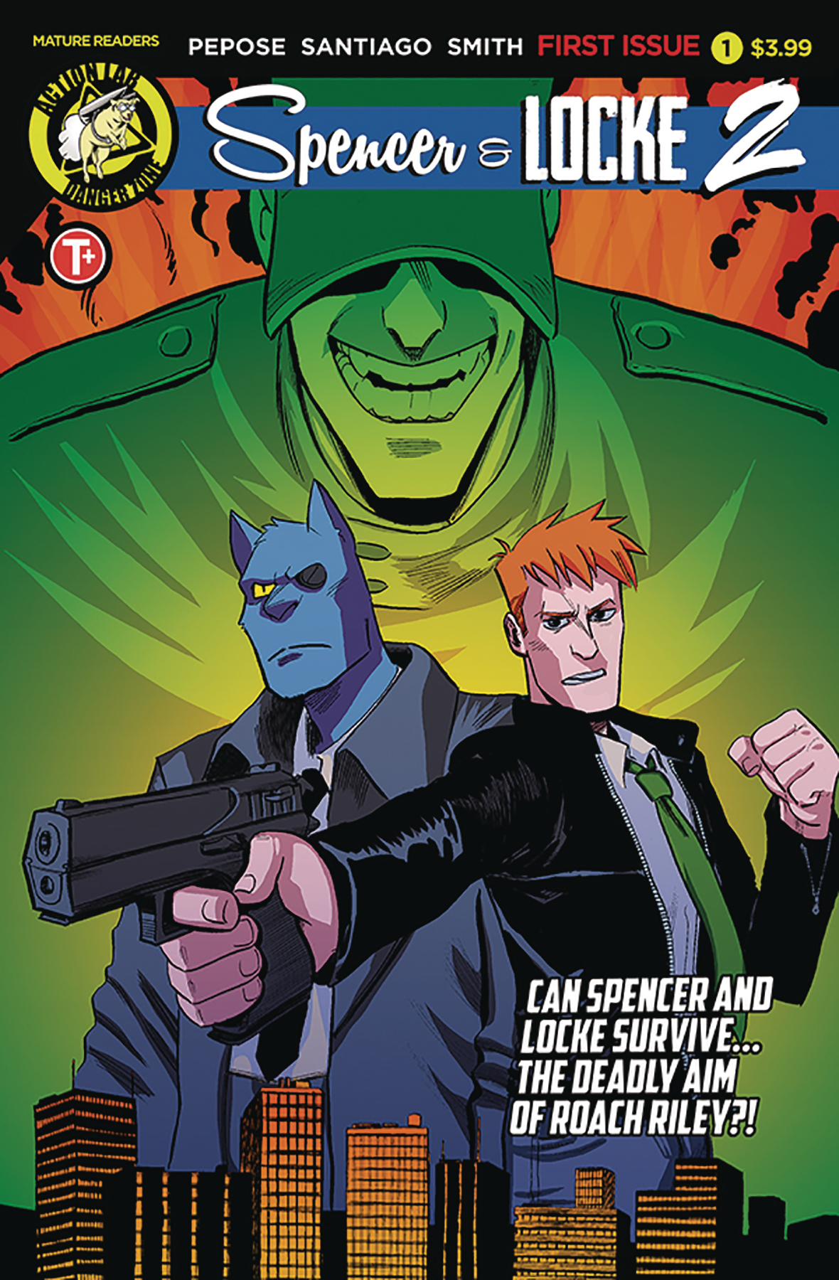
ADVANCED REVIEW: Spencer and Locke, Vol. 2 #1, the return of a book that just keeps getting better

Spencer & Locke, Vol. 2 #1 is out 4/24/2019.

Spencer & Locke, Vol. 2 #1 is out 4/24/2019.

By Zack Quaintance — I’ve been going on about this via Twitter as of late, but the Calvin and Hobbes meets Sin City homage/mash-up Spencer and Locke is, quite simply, a must-read comic, especially for someone like me who bought the Watterson collections at book fairs in fourth grade and spent class time sneak-reading them under my desk. What Spencer and Locke does is imagine Calvin as an adult, still seeing his stuffed tiger (panther here) now as a hard-boiled police detective. That panther, it turns out, has been used all along to cope with trauma.

In Spencer and Locke, Vol. 1 writer David Pepose with artists Jorge Santiago, Jr. and Jasen Smith crafts a compelling and gritty noir mystery while simultaneously deconstructing pretty much every character from the classic Calvin and Hobbes strips. It’s an audacious idea, one that could have come off as ill-advised if the creative team had not executed pretty much everything so perfectly, enfusing the whole ordeal with a massive amount of heart by giving the Calvin character a young daughter of this own (I basically crumbled everytime she interacted with the imaginary panther).

With all this in mind, it would have been easy for the creative team—which has returned here entirely intact—to go back to the Calvin and Hobbes homage well. The book likely has an audience that can’t get enough of it, and so the choice could have been made to go through it all again, this time with just a new case. Pepose, Santiago, and Smith, however, start Spencer and Locke, Vol. 2 #1 by pointing the story in a faithful-yet-new direction: homaging another classic strip, Beetle Bailey.

I’ll talk more about the individual merits of this issue in a moment. First, I’d like to just praise this decision, not only for how it functions in smoothly transitioning to a new story and a new arc, but also for how it opens an entire expanded universe for use in future Spencer and Locke stories, basically enabling the book to draw from nearly 100 years of famed newspaper comic strip characters. Previews for the next issue already seem to indicate a coming send up of Scott Adams and Dilbert, and basically all I’m saying is now we might get a rabid Snoopy cast as a pitbull in the service of a criminal Charlie Brown—just imagine.

So, yes, major points to this comic for that decision. It should be noted too though that Spencer and Locke Vol. 2 #1 is on its own merits an excellent comic, much as the previous installments of this story have all been. Santiago Jr. and Smith continue to impress with their shifting aesthetics. Whereas in the first book the duo bounced seamlessly between Watterson and Frank Miller homages, this new issue requires them to also mimic Beetle Bailey, and with an assist from letterer Colin Bell, it fits right in with the rest of the story.   

Pepose’s script tries some new things as well. What I found perhaps most interesting was the way Spencer (who is the Hobbes analog here) started to become more aggressive, more feral in the way Locke pictured him. Pepose seems to be using that depiction of the imaginary panther to clue readers in on Locke’s fraying mental state. Like the expanded use of comic strip characters, an increased emotional range for the panther seems to expand the plethora of storytelling techniques available to this comic in a vast and welcomed way.

Sometimes a book like Spencer and Locke strikes fire and struggles moving forward to replicate that same energy. That’s not the case here. Fans of the first series—a group I count myself firmly among—can rest easy, this comic has gotten even better.  

Overall: Spencer & Locke, Vol. 2 #1 is the best kind of sequel, one that stays faithful to the core concept while expanding the world in new and exciting ways. The emotional core, the fond homages to classic newspaper strips, the noir mystery—it’s all back and even better here. 9.2/10

Spencer & Locke, Vol. 2 #1
Writer:
David Pepose
Artist: Jorge Santiago, Jr.
Colorist: Jasen Smith
Letterer: Colin Bell
Publisher: Action Lab
Price: $3.99
Release Date: April 24, 2019

Check out Harry Kassen’s recent interview with the creators!

For more comic book reviews, check out our review archives.

Zack Quaintance is a tech reporter by day and freelance writer by night/weekend. He Tweets compulsively about storytelling and comics as BatmansBookcase.

REVIEW: Vault Comics’ Wasted Space #7 makes smooth transition into ongoing monthly comic

Wasted Space #7 is out 2/27/2019.

By Zack Quaintance — I’ve been reviewing Wasted Space since the series started in April of last year, and I’ve loved this book from the start. As I wrote in our Top Comics to Buy for February 27, 2019 feature this week, this is the best original space opera in all of comics today. You can read more detailed and nuanced thoughts over on our Reviews Page, but to sum it up, I think this is a versatile and smart comic, one as capable of making jokes about sex robots as it is asking profound questions about religion and power structures.

This is all a means of establishing why I was so excited when late last year publisher Vault Comics announced that the book would be its first proper ongoing series, extending past the always-difficult 20 issue mark. Now, I’m not always one to clamor for more, more, more from creatives, believing as I do that inspiration is a flighty and special commodity, and that writers, artists, etc. shouldn’t mine topical areas that have long gone dry. Wasted Space, however, has brimmed from its inception with almost too many ideas, too many hilarious exchanges, exciting conflicts, and just straight up space operetic adventures.

In Wasted Space #7, the value of transitioning from a finite story to a longer ongoing series for a book like this becomes clear: writer Michael Moreci is able to dedicate more space to the excellent characters he’s been building for half a dozen issues, giving us a chance to get to know them a little bit better. This is—make no mistake—an exciting issue, in which several major plot developments (especially for Dust and Molly) come to a head and push our characters into new directions. But there are also several scenes I think are only possible in the context of a longer-form story

And they’re some of my favorite scenes in this issue. I’m thinking specifically here of the opening, in which Billy and Molly have one of the series trademark philosophical conversations in a cosmic convenience store (rendered with great detail and better colors by the art duo of Hayden Sherman and Jason Wordie). Billy leans back and pours blue space slurpee directly into his mouth as Molly essentially satirizes social media, landing the Wasted Space culture commentary line of the issue with: I have been to the social stacks though. You have terrible people saying terrible things, then you have so-called good people assuming everyone who doesn’t share their exact principles is a total monster. And all it leads to is everyone screaming and no one listening. As usual, this is great stuff.

So yes, while not every comic is best-served by long-form serial narrative, Wasted Space certainly is, quickly making the most of the format and giving us more than enough value for the price of admission. One last note...the editorial team is already buzzing about how good Wasted Space #8 is, so I for one am circling my (non-existent and entirely theoretical) calendar for its due date, March 27.

Overall: Wasted Space #7 is another great example of this books strengths: operatic space adventure blended with philosophical discourse about modern society, all filtered through Hayden Sherman and Jason Wordie’s fantastic artwork. This remains one of the best comics today. 9.5/10

Wasted Space #7
Writer:
Michael Moreci
Artist: Hayden Sherman
Colorist: Jason Wordie
Letterer: Jim Campbell
Publisher: Vault Comics
Price: $3.99

For more comic book reviews, check out our review archives.

Zack Quaintance is a tech reporter by day and freelance writer by night/weekend. He Tweets compulsively about storytelling and comics as BatmansBookcase.


REVIEW: Ice Cream Man #10, one step back and two steps toward that other dimension

Ice Cream Man #10 is out 2/27/2019.

By Zack Quaintance — There was bound to be a bit of a slowing down after the revelations of Ice Cream Man #9, a comic that (cliche alert!) took everything you thought you knew about this series and flipped it on its head. Ice Cream Man #10 had the difficult task ahead of it of returning the audience back ever so slightly to the core concept of this series, while still building on the mind-bending preceding chapter.

For those who may have missed it, Ice Cream Man #9 put the titular white-clad ice cream man in the foreground along with the black clad hero figure who’s been chasing him (and who he murdered in Ice Cream Man #8, but that’s a whole other thing…), and it put them front and center in what is presumably a different planet...or a different dimension...or our same planet during a mythological time of gods when fate was still undecided...or all three? As you can see, the whole thing was very Stephen King’s Dark Tower.

The effect it had on the audience was all very impressive, reorienting our understanding of the connective tissue between the preceding eight issues. Ice Cream Man #10 doles out, hmm, let’s say a half scoop of more context around that, while instead returning to the horror-tinged vignettes that have run throughout this series. This was a great choice, reminding us that while, yes there is some sort of potentially cosmic epic of gods and spirits raging behind the mundane everyday facade of the world, possibly spilling over at times to inflict great pain and suffering upon the normals (normals like us), the real important stuff here has been that everyday facade all along.

Now, I won’t front like I have any idea whatsoever what may or may not happen in the final three issues of this series. C’mon—I know my limits, but I think making it just as much about the individuals we’ve seen brutalized, tormented, and in rare instances left to grow old and happy as it is about whoever these elemental forces are? Well, I think that’s a very good flavor, indeed (jesus, sorry about that, it’s late and I clearly should have written this earlier…).

In more practical matters, it should perhaps be noted that the vast majority of this issue was written in Spanish. I can read Spanish myself at maybe a third grade level, somewhere in that vicinity, and I didn’t struggle with comprehension at any point, not even for a moment. If you have even a cursory handle on the language, you’ll glide seamlessly through it. Even if you don’t, though, you’ll be just fine. If you really need to know every last word, Google Translate has gotten amazingly proficient lately (seriously, it’s one of the best inventions of our modern era and like nobody talks about it...we can instantly translate like anything!). This entire issue is set on the border, and writer W. Maxwell Prince approaches it with the attention to immersive detail that has powered this entire series.

The venue shift really works well for this story and this comic, given that to date everything took place in an idyllic (on the surface, anyway) suburb. Essentially, it fits with the expanded scope of the story as established by last issue. If this is going to be a tale of deep and massive forces, it needs to effect all of space and time, and that’s what we start to get in Ice Cream Man #10. Meanwhile, Martin Morazzo’s artwork continues to impress with colors by Chris O’Halloran, and as usual, the letterer, in this case Good Old Neon (yes, you read that right), is the unsung hero of the creative team.

Overall: One step back and two steps in some potentially cosmic direction nobody saw coming, Ice Cream Man #10 nudges the series back toward its core concept—horror vignettes—while still pushing forward the overarching narrative. This is one of the best comics today, and we should all be grateful for it. 9.4/10

Ice Cream Man #10
Writer:
W. Maxwell Prince
Artist: Martin Morazzo
Colorist: Chris O’Halloran
Letterer: Good Old Neon
Publisher: Image Comics
Price: $3.99

For more comic book reviews, check out our review archives.

Zack Quaintance is a tech reporter by day and freelance writer by night/weekend. He Tweets compulsively about storytelling and comics as BatmansBookcase.


REVIEW: Punks Not Dead: London Calling #1 adds mystery to an already great concept

Punks Not Dead: London Calling #1 is out 2/27/2019.

Punks Not Dead: London Calling #1 is out 2/27/2019.

By Zack Quaintance — The IDW - Black Crown title Punks Not Dead launched early last year from writer David Barnett and artist Martin Simmonds (with flatting by Dee Cunniffee). It was on the tail end of the first wave from the imprint, trailing behind Kid Lobotomy and Assassinistas, which both came with more experienced creators attached, specifically writer Peter Milligan for the former and artist Gilbert Hernandez for the latter. Punks Not Dead, however, emerged as arguably the most audacious and idiosyncratic of the bunch, which as Black Crown readers well know, is really saying something.

See, Punks Not Deads’ first arc (which ran for five issues) told the story of an angsty teen in England who via some supernatural imbroglio got attached to the ghost of Sid Vicious, bassist/vocalist for the seminal punk band, the Sex Pistols. Punks Not Dead—simply put—was a $@&ing blast. I especially enjoyed it, because growing up in the late ‘90s, I used comics and punk for my own escapism (think Marvel Knights, Vertigo, Geoff Johns and Greg Rucka runs at DC...while listening to bands like Pennywise and Bad Religion). As such, a comic about a teenager whose life is charged by the ghost of a punk rocker felt like it was made for me. I loved the characters, the tone, the voice, the concept, all of it.

This is all a long-winded way of saying I’m happy the book is back, and not only is it back but (cliche alert!), it’s back and better than ever. During the comic’s first arc, the creators spent much time establishing the book’s premise, working hard on the pages to introduce us to our protagonist, show us the home life he’s stuck with, and, perhaps most importantly, make it seem if not entirely believable, at least feasible that he’d become entangled with the ghost of Sid Vicious, and they pulled it all off wonderfully. Now, they’re back in the second arc with a solid foundation already built. Barnett and Simmonds use that foundation to launch readers into a suspenseful plot with the first issue of this new series.

Basically, the first arc setup the concept—balancing perfectly between punk and paranormal—and now the second arc is here with a firm call to action. In Punks Not Dead: London Calling #1, we get the same great concept from the earlier issues, just now with a new quest to give our action shape. Writer Barnett’s scripting also feels more confident, a bit more tongue-and-cheek, and Simmonds artwork is, as always, absolutely fantastic sequential storytelling. Add in a tinge of mystery (that I won’t spoil here), and what you get is a truly promising start to the second arc of a great comic.  

Overall: Punks Not Dead: London Calling #1 is this book’s best issue to date, taking the fantastic punk-paranormal premise and building a new suspenseful mystery on top of it. Few books on the market today are as confident and clever as this one, and we should all be excited for its return. Highly recommended. 9.3/10

Punks Not Dead: London Calling #1
Writer:
David Barnett
Artist: Martin Simmonds w/flatting be Dee Cunniffe
Publisher: IDW - Black Crown
Price: $3.99

For more comic book reviews, check out our review archives.

Zack Quaintance is a tech reporter by day and freelance writer by night/weekend. He Tweets compulsively about storytelling and comics as BatmansBookcase.

ADVANCED REVIEW: G. Willow Wilson and Christian Ward’s Invisible Kingdom #1

Invisible Kingdom #1 is due out 3/20/2019.

By Zack Quaintance — Invisible Kingdom #1, the new comic coming next month from writer G. Willow Wilson and artist Christian Ward, is perhaps the next evolution of the ongoing creator-owned sci-fi comic boom. A complex and weighty piece of work, the book uses Ward’s unique (and absolutely stunning) brand of psychedelic space art in tandem with Wilson’s ideas about societal foundations ranging from religion to commerce to forge ahead into new thematic territories. It’s not alone in doing this—Wasted Space and Relay both come to mind as close cousins to this comic—but in its debut issue, Invisible Kingdom seems to offer a new and perhaps more realistic sort of take on this genre.

Realistic is maybe not the right word, given the aliens and intergalactic travel and all of that, but there’s a level of intellectual seriousness here that makes this book stand out from other space epics. To be sure, there are plenty of serious sci-fi comics on the racks today, so that’s maybe also not the best word. There’s actually a panel on the second page that can maybe get this point across much better than I can struggling here with prose. In it, a crew on a space ship are attempting a trick maneuver in the service of some sort of cargo delivery and in weighing the merits of a tricky move, one character notes, But your company-sponsored liability insurance won’t cover—

There’s always that character on distressed sci-fi vessels, the C-3PO who’s fretting is designed to remind the audience exactly how implausible the heroics of braver protagonists are. That character, however, is usually exclaiming some sort of bonkers world-specific jargon or a quick throwaway joke. In Invisible Kingdom, that character reminds us of the ever-looming presence of economics. The book doesn’t apply this plausible lens to just economics, either.

Within its intriguing and aesthetically-powerful world, it gives us similar glimpses into religion, governance, and the way different species react to/treat one another. The end result is a relentlessly thoughtful comic, as well as a sense of narrative confidence that makes it easy to trust these uber talented creators from the book’s earliest pages.

Also, I’ve peppered compliments to Christian Ward’s artwork throughout this piece, but, and excuse me for this, I don’t think I’ve come anywhere close to doing Ward’s contributions justice. The best comics are such an alchemy of creative collaboration it can be tough to evaluate individual elements. This is certainly one of those books. Everything comes together seamlessly, and the end result is greater than the sum of its pieces. Ward’s artwork, however, is—to borrow an Internet phrase—next level good. There isn’t a bad-looking segment, page, or even panel in this entire comic. On the contrary, there are actually several that left me absolutely stunned (that word again!) when I passed over them.

The colors, the character designs, the facial expressions, the panel sizes and composition...it’s all so mind-bendingly luscious and just plain good. Ward has long been a talented psychedelic artist, lending massive talents most recently to Marvel’s Black Bolt. This book, though, has the trappings of a sequential art masterpiece. And for every smaller, detailed panel with a green-skinned character gritting their way through a challenge, there’s a subsequent splash that could be framed and hung on a wall somewhere in a hip loft apartment.

Story-wise, this is an advanced review so we have to tread carefully here, but I think it’s okay to divulge that there are a pair of plot concerns: one related to joining a religious order and another to embezzlement. This is a dense first issue that has to work hard at world-building, so the characters are a bit lightly-defined at the start. That’s OK. Comics like this need to progress further to, to set up world rules and concerns before they can really show us who are central figures are, what they most care about, and why. We do get some great philosophy here and there, enough to draw us into the story further. My only real regret is I’ve read this book so far in advance, it’s going to be a painful long wait for Invisible Kingdom #2.

Overall: Invisible Kingdom is a heady comic you’ll want to read twice to get a better grip on its ambitions and ideas. Fortunately, the artwork in this book is so vibrant and imaginative, immediately re-reading will feel less like a redundancy and more like a second helping of an impossibly-spectacular visual treat. 9.5/10

Invisible Kingdom #1
Writer:
G. Willow Wilson
Artist: Christian Ward
Publisher: Dark Horse Comics - Berger Books
Price: $3.99
Release Date: March 20, 2019

For more comic book reviews, check out our review archives.

Zack Quaintance is a tech reporter by day and freelance writer by night/weekend. He Tweets compulsively about storytelling and comics as BatmansBookcase.

REVIEW: Guardians of the Galaxy #2 slows things down but still contains a MAJOR development

Guardians of the Galaxy #2 is out 2/20/2019.

By Zack Quaintance — As I wrote last month, Guardians of the Galaxy #1 was a natural extension of its creative team’s past work, first of the creator-owned God Country and then more directly of the subsequent Thanos Wins story for Marvel. That debut issue was fast-paced, grandiose, and packed with big moments, while at the same time managing to set up a new concept for this run—Thanos is, indeed, dead, and now he will be reincarnated after his consciousness enters someone new. A team of good guys coalesce around mitigating the threat to the universe that so clearly stems from that.

Guardians of the Galaxy #2 is a much slower affair, especially in its first half. The book seems to collectively take a breath, get itself together, and center itself for a long journey to come, rather than the relatively contained story arcs that marked the aforementioned God Country and Thanos Wins. It’s not boring by any means. Cates is such a good writer that he turns the team’s leader, Peter Quill, drunkenly bemoaning his plight into a really funny interaction with Kitty Pryde, whom Quill has recently had a romantic relationship with (Quill says he has trauma from having been dead and come back to life, and Kitty retorts, You’d hate the X-Men...very funny stuff).

These type of character moments and slower bits of development are key facets of long-form team-based superhero comics, and I almost always welcome them. This one caught me a bit off guard with how soon in the run it came, but, also, this wasn’t entirely a stepback and breath issue. No, the second half of the book sees a major development that will have major ramifications throughout the rest of the run. If the first issue brought our good guy team together, well, this second issue gives them a foil, and in a pretty brilliant bit of narrative plotting, Cates makes it so their goals might even overlap.

Indeed, both the good guys and the bad in this new Guardians book are invested in stopping Thanos from again terrorizing the universe. Without going into too much detail, I’ll just note that the tension between them is likely to arise from their very different ideas on the best way to accomplish this. All the setup then culminates in a grandiose (that word again!) last page cliffhanger, the sort of textbook ending for an entertaining superhero comic that Cates and artist Geoff Shaw all but perfected during their run on Thanos. SPOILER: a team of Dark Guardians comes together and sets out to find Richard Rider in order to murder Gamora…thus giving us the characters and the goals that will be at odds with our heroes.

All in all, while I didn’t white knuckle my way through this comic with a huge grin on my face the way I did the debut issue, I still came away from Guardians of the Galaxy #2 basically certain that this will be a major run with these characters. There’s clearly a huge scale and a big plan at work here, and I’ll be happy to follow it through to completion, enjoying Shaw’s outsized artistry and Cates’ clever dialogue throughout.

Overall: A quieter step-back issue that invests in character moments and funny exchanges while still pushing the grandiose plot from Guardians of the Galaxy #1 forward. There’s clearly a huge scale and big plan at work here, and I’m excited to follow it through to its ending. 8.5/10

Guardians of the Galaxy #2
Writer:
Donny Cates
Artist: Geoff Shaw
Colorist: Marte Gracia
Letterer: VC’s Cory Petit
Publisher: Marvel Comics
Price: $3.99

Check out some of other thoughts about this comic from both this week and the past in our reviews archive.

Zack Quaintance is a tech reporter by day and freelance writer by night/weekend. He Tweets compulsively about storytelling and comics as BatmansBookcase.

REVIEW: Stronghold #1, an ambitious and singular cosmic romance begins

Stronghold #1 is out 2/20/2019.

By Zack Quaintance — I didn’t know what to make of Stronghold #1 when AfterShock Comics first announced it. The book is built around a high concept: a man who may be an omnipotent god-like being (but who doesn’t know it) believes himself to be a fairly dull insurance salesman in the Midwest. Meanwhile, a global secret society has essentially imprisoned him and is keeping watch to ensure he never realizes the truth of his reality. Enter our protagonist, a young woman born into the secret society who falls in love with the powerful being.

Now, in addition to writing for this site, I also do a bit of news writing for Comics Beat (my absolute favorite comic book news site), and one of my own beats over there is AfterShock Comics. It feel to me to essentially find a pithy way to write headlines, snippets, and summaries about this comic...and it was a struggle. There’s no quick pitch, but you know what? An inability to summarize this comic’s plot with something like a Tomb Raider meets Bill Murray’s Groundhog’s Day kind of equation just speaks to how smart and ambitious this comic is. There are, however, no shortage of smart and ambitious ideas in comics these days, especially not from the booming creator-owned comic book segment.

What sets Stronghold apart from similarly lofty concepts is the intellectually commiserate quality of the storytelling craft. Both the writing and art here bring the story a level of complexity and focus that is rare for a monthly comic. The creators seem to be well aware that they’re asking readers to meet them halfway on a concept that’s difficult to quickly grasp, and so they leave it all out there with the art and scripting. Stronghold #1 is immersive and relatable from its first page, be it through Ryan Kelly and Dee Cunniffe’s intrictate artwork or the relatable ennui and listlessness writer Phil Hester’s script proscribes to its main character. The plot in Stronghold is far-fetched and unlikely, but the execution of the story feels searingly authentic and real.

For every scene in which we see the powerful god being plunge invulnerable into a body water, there is a corresponding beat in which the characters feel shy on a first date, wondering if they’re dressed right for the occasion or heading off to a friend’s concert (supposedly). There is somewhat of a sci-fi comic boom happening right now, with ideas and levels of reading for nearly all tastes. Romance comics, however, remained mostly unexplored, even in a modern marketplace that is perhaps oversaturated with new series.

What Stronghold seems to do is use its science fiction trappings to reel in an audience for an emotional story rooted entirely in a romance between a young woman raised in a questionable cult (my interpretation) and a lonely man dissatisfied with normal working life. And it all adds up to as strong of a debut comic as we’ve gotten so far this year. Basically, I had no idea I liked “dark cosmic romance” comics this much until this book came along.

Overall: A combination high-concept science fiction story and quiet romance, there really is nothing quite like Stronghold #1 happening in comics today. It’s an interesting concept, to be sure, but the real strength here is the top tier storytelling done by the team of Hester, Kelly, Cunniffe, and Bowland. I highly recommend this comic. 9.5/10

Stronghold #1
Writer:
Phil Hester
Artist: Ryan Kelly
Colorist: Dee Cunniffe
Letterer: Simon Bowland
Publisher: AfterShock Comics
Price: $3.99

For more comic book reviews, check out our review archives.

Zack Quaintance is a tech reporter by day and freelance writer by night/weekend. He Tweets compulsively about storytelling and comics as BatmansBookcase.

REVIEW: Hot Lunch Special #5, a conclusion promises more

Hot Lunch Special #5 is out 2/20/2019.

Hot Lunch Special #5 is out 2/20/2019.

By Zack Quaintance — Hot Lunch Special, which launched from AfterShock Comics in August, is a unique series, a crime story that feels like Fargo steeped in intense family drama as well as the dry intricacies of the food distribution business. It’s done what (in my opinion) many of the most interesting crime dramas do, which is kill off characters one presumes to be safe or integral to its plot, doing so at a pace closer to Game of Thrones than to a nice Midwestern comic book like this one. This week’s Hot Lunch Special #5, the series finale (at least for now…), is no exception.

And I don’t think it’s a spoiler to note that in this issue death has come to the folks at Khoury Foods, as well as to their Chicago-based, mildly Irish mob-connected Moran family rivals. The entire series (which has been bloody throughout) has clearly been building to this climax, which is essentially a full-issue standoff in which revenge, prosperity, and the continued safety of certain family members (who have all been through a lot) is at stake. An action-heavy and consequential ending has been promised, maybe going as far back as issue #1 or #2, and an action-heavy and consequential ending is what Hot Lunch Special #5 delivers.

Eliot Rahal continues to write the hell out of this comic with reckless abandon, incorporating plot twists that I presume are difficult for him as a creator. Rahal is literally killing his darlings left and right throughout this book, doing so in ways that feel organic rather than contrived for long-term or poignant plotting purposes. He also revels in the esoteric nature of the food business he’s set out to portray here. It isn’t played for laughs, and it really hasn’t been at any point through this series. It’s depicted as what it is: a day’s work, a way for generations of a family (and for those they service) to literally eat. There’s so much respect in that, even if he surrounds it all with madcap bloody violence (because, hey, this is still comics…).

Jorge Fornes, meanwhile, is a superstar in the making. In fact, the Hot Lunch Special co-creator and artist has already been tabbed by DC Comics as what looks to be its next big Batman artist, and I haven’t seen one of the Big 2 act this fast to find a perfect fit for a major new talent since Donny Cates got to wreck the future of the universe over at Marvel (and before that Tom King was drafted to write Batman and Mister Miracle). Fornes was made to draw the type of moody noir and action sequences as at home in Hot Lunch Special as they seem likely to be in forthcoming issues of Batman.

So yes, this issue was a satisfying climax that absolved some jams, made its characters pay high prices, and delivered on much of the foreshadowing and tension incorporated into earlier issues. If you’ve read all four of the proceeding chapters, you’ll read this one, and if you’ve been intrigued by what you’ve heard of Hot Lunch Special, you’ll be happy to know it has an end that won’t diminish anything that came before it once you read it all in trade. The last item of note here is that that ending also all but guarantees future issues. The stories in the first volume are essentially wrapped up in a way that creates urgent issues to be absolved moving forward. Exciting stuff.

Overall: Hot Lunch Special #5 is an action-packed and tragic conclusion that all but promises more story. If you’ve enjoyed the other issues of this book, you’re likely to love it’s ending, and if you’ve been intrigued by what you’ve heard, you’ll be happy to know it will all read quite well in trade. 8.5/10

Hot Lunch Special #5
Writer:
Eliot Rahal
Artist: Jorge Fornes
Letterer: Taylor Esposito
Publisher: AfterShock Comics
Price: $3.99

For more comic book reviews, check out our review archives.

Zack Quaintance is a tech reporter by day and freelance writer by night/weekend. He Tweets compulsively about storytelling and comics as BatmansBookcase.

REVIEW: Relay #4, an unsurprisingly mind-bending return with a new artist

Relay #4 is out 2/20/2019.

By Zack Quaintance — Relay has been on a break, presumably due to the departure of Andy Clarke, who drew the first three issues of the series. In fact, the last issue—Relay #3—came out on Sept. 5, just over four months ago. In just three issues, this comic has amassed a steady set of rabid fans, folks who were respectful-yet-forceful with me on Twitter in recent weeks, asking when they should expect a new issue (I’m not any sort of official representative friends, just an appreciator of this comic).

Anyway, the point is that all seems to be behind us now, with Clarke leaving the book in favor of another uber-talented imaginative artist, Dalibor Talajic, who is fresh off drawing Relay publisher AfterShock Comics’ first-ever original graphic novel, Witch Hammer (a book we liked quite a bit). Before we delve into the individuality of this specific issue, let me just say this about the art shift: 1. Clarke was doing singular and nigh-visionary work on this comic, and it is regretful that he has now seemingly departed; 2. Talajic is a more-than capable replacement and will also do strong work. These two thoughts can and do exist. They’re not bad or good as they apply to Relay (more discussion of that in a moment), they just are.

I suppose the chief question is whether this is still the book we remember from last fall. And yes, it absolutely is. Pretty much everything that made Relay such a mind-bending and intriguing sci-fi trip is back, as are the deep thematic interests and the always-earned and never-obvious plot twists. This is still a very, very good comic that I can endorse resolutely without any sort of hesitation.

The one visual change I noticed most was that Talajic’s work lends the proceedings a grittier feel than we had under Clarke. The way Clarke drew the sci-fi worlds in Relay, they felt like a false utopia, a world that’s surface was gleaming and enlightened but its deeper reaches were a maze of psychological misgivings. Much of that remains with Talajic, yet the danger seems a bit more present, just a bit more looming. This is also perhaps by design, as the danger has become more blatant as our story has gone on. I don’t prefer either rendering—they both work and work well. Although I will note that this issue feels like a bit of a come down from the absurdly trippy heights we hit in #3.

Now comes the hard part for me as a reviewer: parsing through one of the most complex stories in comics to tell you all what to expect in terms of quality and also maybe help you to understand what might be going on. Our main characters perceptions feel as muddled as they have from the start, his ideas about what might be true and false, and who might be pushing forward misleading information and why. There is mystery around all that, but—and this is massively to writer Zac Thompson’s credit—there is never disorientation. We have a close perspective with our protagonist that allows us to experience a clear story with him, knowing what he does while wondering all his same questions. It’s a great way to take an audience through such an intellectually-ambitious science fiction story, and Thompson nails it (yet again).

The way the Relay is depicted is a perfect example of this. We as an audience don’t really know what it’s for or why...but neither does our hero. He knows it’s always been apart of the world he’s lived on (Earth), and he knows that he’s always been told it is crucial to civilization, a benefit to any and all systems. He continues to doubt whether any (or all) of that is true, while searching for the answers. I don’t know what he’s going to find, but I continue to love being part of this journey.  

Overall: With artist Dalibor Talajic now on board for at least the next two issues, Relay returns and loses very little. This issue features all the deeply-smart sci-fi themes and perfectly-executed plot twists that made the first three chapters so exciting. 9.2/10

Relay #4
Story:
Zac Thompson, Eric Bromberg, & Donny Cates
Writer: Zac Thompson
Artist: Dalibor Talajic
Colorist: Jose Villarrubia
Letterer: Charles Pritchett
Publisher: AfterShock Comics
Price: $3.99

For more comic book reviews, check out our review archives.

Zack Quaintance is a tech reporter by day and freelance writer by night/weekend. He Tweets compulsively about storytelling and comics as BatmansBookcase.