REVIEW: Criminal #3, a comic for people really into comics

Criminal #3 is out 3/20/2019.

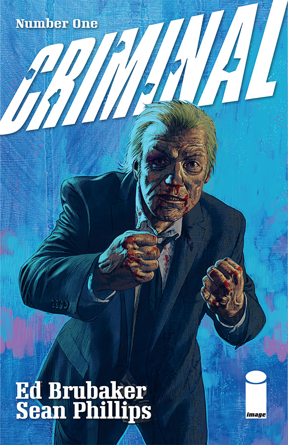
By Zack Quaintance — This new run of Criminal is, without question, a comics fan’s comic. The book’s writer, Ed Brubaker, was recently on John Siuntres Word Balloon podcast discussing how part of his goal with it is to create a series that begs to be read monthly. Through three issues, Brubaker and long-time collaborator artist Sean Phillips have certainly done that. Criminal #1 was a tour de force in graphic serial storytelling, with an extended length that enabled the team to tell a rewarding and complete story, while at the same time seeding ideas for subsequent issues to follow up.

Criminal #2 subsequently saw an abrupt shift to a different time and a different set of characters than the first issue (though the protagonist should be well familiar to readers of previous volumes of this anthology comic). Criminal #3 is now the second part of an arc started in the preceding issue. This structure for the trio of opening issues firmly bucks the recent trend throughout comics of writing distinct four-five-six-issue arcs that are perfectly suited to be compiled in a trade paperback. Bucking that trend does exactly what Brubaker discussed on that podcast: it gives comics buyers a pressing reason to pick up the book each month. I know I have been.

The second reason that Criminal #3 firmly entrenches this book as a comics fan’s comic is that it occupies the same thematic ground as Criminal #2. In this two-part arc, a surly and deeply unpleasant veteran/semi-legendary comicbook artist is bent on recovering some artwork he tells his apprentice has wrongly been taken from him. There are twists, to be sure, and I won’t go into them here, but I will say that there are a plentiful number of nods to industry insiders, long-time fans, and comicbook historians. It all adds up to an immersive and quisi meta reading experience.

This issue is also a bold one. Brubaker and Phillips have an all-time great writer-artist alchemy, and they’ve had it for years. They don’t rock that boat here by trying anything structurally experimental or thematically edgy. What they do, however, is take a read of the current comics landscape and come back with somewhat of a defiant statement within the context of an expertly-told and very organic story. What I mean is that like all of us who way way waaaay into the world of comics, they’ve been hearing the gloom and doom of mercurial sales numbers and voices predicting the end of everything from paper comics to the direct market to superhero stories that span eight continuous decades.

They’ve clearly heard it all, and rather than writing an opinion column or going on a podcast—things we’ve seen and heard veteran creators, retailers and industry watchers do ad nauseum—they have an actual story stand as a refutation. Hell, at one point the curmudgeonly artist who’s seen it all even comes out and says Comics have been dying since 1954, kid...don’t let that stop you...  

Hearing that reassurance related to the medium I love in the context of a story that shows what it’s capable of had a different and much more poignant impact on me. It seemed to be encouraging, not only for me as a review/aspiring creator, but for the continuing existence of stories of any type in the face of a changing economic reality. It seemed to say that the security in exchange for stories has never been a given, has never been an easy thing to achieve, and yet art has been made anway. If you want to do this, do it. The rest will figure itself out, for better or worse.

Overall: Criminal #3, like the rest of Brubaker and Phillips’ latest series, is a real comics fan’s comic, filled with insider touches and meta commentary, all encased within the duo’s all-time great creative chemistry. This book is a must-read, every damn month. 9.6/10

Criminal #3
Writer:
Ed Brubaker
Artist: Sean Phillips
Colorist: Jacob Phillips
Publisher: Image Comics
Price: $3.99

Get a refresher on the other volumes of Criminal!

For more comic book reviews, check out our review archives.

Zack Quaintance is a tech reporter by day and freelance writer by night/weekend. He Tweets compulsively about storytelling and comics as BatmansBookcase.  

REVIEW: Lazarus Risen #1, same fantastic comic, new deeper format

Lazarus Risen #1 is out 3/20/2019.

By Zack Quaintance — I really don’t think it’s possible to heap enough praise atop writer Greg Rucka and artist Michael Lark’s immersive dystopian near-future comic epic, Lazarus. I recently re-read the entire series, and once I got about mid-way through the second volume, I almost literally could not put it down. The world is so well-built, the characters compelling and complex, the dilemmas they face suspenseful. All in all, this is one of the smartest and most compulsively readable comics on the market, a must-read for any fan of the medium.

To date, there have been 28 issues of Lazarus in the main series, plus a six-issue auxiliary series titled Lazarus: X+66, which fills in the gaps of side characters and the story’s broader world over the course of a 12-month period. All told, that’s about 34 incredible issues of content, plus some other supplemental material with more information that help support a Lazarus RPG. This is all a means of saying that even though Lazarus: Risen #1 is a a new #1 issue, it’s set in a thoroughly explored world during what seems like not-quite the midway point of a long story.

The reason this issue gets the new #1 treatment is that the book is back with a new format: quarterly releases that clock in at an extended length. Let me start this review (three paragraphs in, streamlined I am not) by noting that the story, artwork, plot, and characters are just as strong as ever. The quality in Lazarus never wavers, not even a little bit. Rucka and Lark are a skilled and veteran team that have worked together for years, and it shows. This is the most fully-formed comic on the market—bar none—and as a result it often feels like the creative team is a conduit for the truth of this plot. Nothing is ever contrived, not even a bit, and Lazarus Risen #1 is no exception. It’s as compulsive readable and utterly immersive as all that’s come before it.

So, what then of the new format? Surely, it must have changed something. I suppose it did. Rucka and Lark being such a veteran creative team means each issue of Lazarus to date has tread that rarefied ground in which the individual chapters feel both episodic and part of a larger narrative. Each issue has story beats and damn near close to a three-act structure. Extending the length allows the team to pace the story just a tiny bit differently, opening up a few pages for quieter and more subtle character work and plotting. Rucka points this out in publication, but in this issue that means we get a very telling moment between Bethany Carlyle and and her husband. It’s the type of scene that maybe didn’t fit into any of the tighter issues of the past.

This issue hums along, and Lazarus remains the type of comic you start, blink, and realize you’ve devoured...before going back to pour over every page again. Few comics feel as real as this one, and Lazarus Risen #1 does a number of interesting things with the ongoing plot and characters, moving pieces into place that speak of a larger coming battle, at home and with the forces abroad. It’s not really a jumping on point for new readers—indeed, the previous five volumes at minimum are necessary here—before for those who have followed this journey in recent time or come to it lately, this comic is everything they could hope for from a return.   

Overall: Lazarus Risen #1 with its new extended format feels like a natural evolution of one of the best comics on the market today. At this point, the world is so well-realized and the plot so compelling, nothing is lost with a longer wait and much is gained with more space for additional complexity. 9.8/10

Lazarus Risen #1
Writer:
Greg Rucka
Artist: Michael Lark w/Tyler Boss
Colorist: Santi Arcas
Letterer: Simon Bowland
Publisher: Image Comics
Price: $7.99

Get caught up on the book with our Lazarus Retrospective!

For more comic book reviews, check out our review archives.

Zack Quaintance is a tech reporter by day and freelance writer by night/weekend. He Tweets compulsively about storytelling and comics as BatmansBookcase.

REVIEW: Die #4, a high point for a classic in the making

Die #4 is out 3/6/2019.

Die #4 is out 3/6/2019.

By Zack Quaintance — Well folks, it happened. Die landed an issue that knocked me out, blew me away, floored me, thrilled me, you name it. Whatever cliche you want to go with for being impressed, that’s how I felt about Die #4. That’s not to say I didn’t like the previous issues. Hell, I gave very high marks to both Die #1 and Die #2, going so far as to write full reviews about them (which is something I generally only do for debut issues, prominent Big 2 titles, and creator-owned books I really like). In addition, the book is basically always one of our 5 Top Comics to Buy selections, and Die #1 was one of our best new comics the month it debuted.

So yes, I like Die quite a bit. I liked the dark tone it struck from the start, a tone I’ve long thought has been lacking from the wave of popcorn nostalgia-driven lookbacks at role playing games from the ‘80s. I liked how the real villain of this story seemed likely to become the lives we lived after being teens as well as the lessons we didn’t learn, and I loved how the book harkened back to Tolkien with its third issue, portraying the horrors of WWI he is likely to have experienced en route to creating this whole damn genre.

So, with all that praise heaped upon it, how then did Die #4 exceed my expectations even further to knock me out, floor me, thrill me...again, pick your cliche? This is maybe a cardinal sin as a reviewer, but I’m going to have to say I’m not quite sure. My best theory, however, is that through the first three issues, I become much more familiar with the backstories and desires of the lead characters, enough that in this issue when we get complicated stories for basically all of them, I found myself as thoroughly invested as I do in much longer running creator-owned books like Monstress, Saga, or Die writer Kieron Gillen’s The Wicked + The Divine.

My other theory is that the creators themselves become more comfortable with the world, premise, and characters here, so much so that they were able to shift in this fourth issue to another gear. I certainly think Stephanie Hans’ stunning artwork achieves of level of clarity in this issue among the top tier of graphic sequential storytelling being done right now. Hans leaves us with a number of incredibly memorable visuals, starting at the very beginning with what is so far the book’s best cover. From there the list expands rapildy, with my personal favorite artwork including the establishing shot of the glass city, the characters being celebrated in its streets, wounded Isabelle in conversation with deities in the temple, the stories within the stories, and the list goes on. The year is young, but I think this issue is so far its most gorgeous fantasy book (although, I suppose Isola #6 may take issue with that).

As far as the story, Die #4 is the type of comic that’s told so well it seems like it must have been easy to write, like it all came together by some divine magic into one complete whole. This is a massive feat with an ensemble cast, one that the aforementioned best issues of Wic + Div have accomplished as have some of the best story arcs of B.P.R.D. Those are classic comics, to be sure, and if Die continues to put out out issues like this in the coming years, it will be right in the conversation with them.

Overall: Die #4 is a high-mark for a young series that has classic written all over it. This is the best type of new comic, one that tells a long story comprised of several disparate and wholly memorable chapters. Make space up there with Saga and Monstress, Die is quickly becoming one of Image’s best. 9.6/10

Die #4
Writer:
Kieron Gillen
Artist: Stephanie Hans
Letterer: Clayton Cowles
Publisher: Image Comics
Price: $3.99

For more comic book reviews, check out our review archives.

Zack Quaintance is a tech reporter by day and freelance writer by night/weekend. He Tweets compulsively about storytelling and comics as BatmansBookcase.

REVIEW: Ice Cream Man #10, one step back and two steps toward that other dimension

Ice Cream Man #10 is out 2/27/2019.

By Zack Quaintance — There was bound to be a bit of a slowing down after the revelations of Ice Cream Man #9, a comic that (cliche alert!) took everything you thought you knew about this series and flipped it on its head. Ice Cream Man #10 had the difficult task ahead of it of returning the audience back ever so slightly to the core concept of this series, while still building on the mind-bending preceding chapter.

For those who may have missed it, Ice Cream Man #9 put the titular white-clad ice cream man in the foreground along with the black clad hero figure who’s been chasing him (and who he murdered in Ice Cream Man #8, but that’s a whole other thing…), and it put them front and center in what is presumably a different planet...or a different dimension...or our same planet during a mythological time of gods when fate was still undecided...or all three? As you can see, the whole thing was very Stephen King’s Dark Tower.

The effect it had on the audience was all very impressive, reorienting our understanding of the connective tissue between the preceding eight issues. Ice Cream Man #10 doles out, hmm, let’s say a half scoop of more context around that, while instead returning to the horror-tinged vignettes that have run throughout this series. This was a great choice, reminding us that while, yes there is some sort of potentially cosmic epic of gods and spirits raging behind the mundane everyday facade of the world, possibly spilling over at times to inflict great pain and suffering upon the normals (normals like us), the real important stuff here has been that everyday facade all along.

Now, I won’t front like I have any idea whatsoever what may or may not happen in the final three issues of this series. C’mon—I know my limits, but I think making it just as much about the individuals we’ve seen brutalized, tormented, and in rare instances left to grow old and happy as it is about whoever these elemental forces are? Well, I think that’s a very good flavor, indeed (jesus, sorry about that, it’s late and I clearly should have written this earlier…).

In more practical matters, it should perhaps be noted that the vast majority of this issue was written in Spanish. I can read Spanish myself at maybe a third grade level, somewhere in that vicinity, and I didn’t struggle with comprehension at any point, not even for a moment. If you have even a cursory handle on the language, you’ll glide seamlessly through it. Even if you don’t, though, you’ll be just fine. If you really need to know every last word, Google Translate has gotten amazingly proficient lately (seriously, it’s one of the best inventions of our modern era and like nobody talks about it...we can instantly translate like anything!). This entire issue is set on the border, and writer W. Maxwell Prince approaches it with the attention to immersive detail that has powered this entire series.

The venue shift really works well for this story and this comic, given that to date everything took place in an idyllic (on the surface, anyway) suburb. Essentially, it fits with the expanded scope of the story as established by last issue. If this is going to be a tale of deep and massive forces, it needs to effect all of space and time, and that’s what we start to get in Ice Cream Man #10. Meanwhile, Martin Morazzo’s artwork continues to impress with colors by Chris O’Halloran, and as usual, the letterer, in this case Good Old Neon (yes, you read that right), is the unsung hero of the creative team.

Overall: One step back and two steps in some potentially cosmic direction nobody saw coming, Ice Cream Man #10 nudges the series back toward its core concept—horror vignettes—while still pushing forward the overarching narrative. This is one of the best comics today, and we should all be grateful for it. 9.4/10

Ice Cream Man #10
Writer:
W. Maxwell Prince
Artist: Martin Morazzo
Colorist: Chris O’Halloran
Letterer: Good Old Neon
Publisher: Image Comics
Price: $3.99

For more comic book reviews, check out our review archives.

Zack Quaintance is a tech reporter by day and freelance writer by night/weekend. He Tweets compulsively about storytelling and comics as BatmansBookcase.


REVIEW: Gideon Falls #11 stirs horror with more unpredictable developments

Gideon Falls #11 is out 2/13/2019.

By Jarred A. Luján — I’m not going to pretend like I’ve read everything Jeff Lemire has ever written. I’ve read some of his Big 2 work, but only a little of his independent stuff, including his recent Hit-Girl run. Andrea Sorrentino is a similar case, in that before Gideon Falls I’d seen some of his stuff for Marvel and DC, but otherwise, I couldn’t say I devoutly followed his releases. So when Gideon Falls launched, I only picked it up because of a recommendation on Twitter from Marvel writer Matthew Rosenberg.

Just shy of a year later, I haven’t missed a single issue of this book. There are few better examples of why than this month’s issue, Gideon Falls #11.

So many of Gideon Falls’ horror aspects come from Sorrentino’s willingness to take chances with the way he lays his artwork out. The art in this issue, for example, ranges from traditional panel layouts, to pages with a cyclical panel system, to a page that’s entirely upside down, to make-shift panels scrawled throughout splash pages, to back-to-back-to-back double spread pages. When things really begin to come undone here, Sorrentino’s artwork lets the page come undone as well. Allowing it to feel as disjointed and unnerved as our characters do has consistently set Gideon Falls apart from other horror comics.

One of my favorite parts of Gideon Falls has also been the pacing. Lemire has only given us bits and pieces of this intricate plot, and every big influx of information is countered with new ground that makes readers aware of how little they actually know. Lemire is giving the audience pieces to the puzzle, sure, but he’s still withholding how those pieces connect. At 11 issues in, I still have no clue where this story is going, and, just like Sorrentino’s art, that is part of what makes this book so horrifying to me: there is no safety in the prediction of the narrative. As a reader, you are immersed in the protagonists’ stories by knowing only as much as they do. This issue, following what was likely the biggest issue of the run so far, pulled back the curtain on the workings of the Black Barn only to reveal that there are many more curtains. Lemire giveth, Lemire taketh away.

The next chapter of Gideon Falls releases in April, giving us all a month to try and figure out what the hell is going on…but if the past is any indication, I have a feeling we’ll fail at that.

Overall: This issue is as frightening as it is dizzying. There is so much going on in this series, and readers don’t yet know how deep into the mysteries and the story they’ve gone. This is a horror book in a class of its own, and I highly recommend doing yourself a favor and getting caught up with it. 9.0/10

Gideon Falls #11
Writer:
Jeff Lemire
Artist: Andrea Sorrentino
Colorist: Dave Stewart
Letterer: Steve Wands
Publisher: Image Comics
Price: $3.99

Jarred A. Luján makes comics, studies existential philosophy, and listens to hip-hop too loudly. For bad jokes and dog pictures, you can follow him on Twitter.

REVIEW: Ice Cream Man #9 changes everything you knew about this book

Ice Cream Man #9 is out 1/30/2019.

By Zack Quaintance — Whoa. This issue was nuts, in the best way, and I’m going to do my best to not tip into spoiler territory here. However, I make no promises. So, if you really want to avoid any and all chance of spoilers, I encourage you to skip to the Overall section of this review down at the bottom for a spoiler-free word about whether you should buy this comic. If you have read Ice Cream Man #9, well friend, strap in, because this is about to get wild.

Ice Cream Man #9 up-ended my perception about the scope of this comic. It also sent me back through all eight of previous issues looking for clues. And you know what I found? Tons of them, along with a new sense of what this book is accomplishing. As I wrote in my review of Ice Cream Man #8, I thought this series was a commentary on instant gratification of the soul, on giving into easy feelings of fear and anxiety versus doing the difficult self work it takes to be optimistic, contented, happy. And it is that, to extent, but it’s also quite a bit more.

Ice Cream Man is a book telling an overarching story despite on its surface largely appearing to be an anthology series, albeit one with light connective tissue. The spider from the first issue here, a cop we vaguely know there, plus the titular Ice Cream Man and his weird enemy cowboy guy. A closer look, however, reveals that all along there has been a battle raging between two ancient polemic forces, one of malicious chaos and another that just wants folks to know we’re all friends, all connected, all just trying to live our peaceful lives.

To tell that story, writer W. Maxwell Prince, artist Martin Morazzo, colorist Chris O’Halloran, and letterer Good Old Neon have tapped almost every unique quality inherent to the monthly comics medium, ranging from the slow nature of the release schedule (used to draw the focus to the vignettes, rather than the forces in the background) to juke readers on the format of the narrative to the lettering, which is shaded white in boxes for the evil monologues and black fro the good. This comic has been a true work of patient serialized art, and now in Ice Cream Man #9, the creators are pulling what this book is really about from the background to center stage. And, to be crass, this sh** is f***ing epic.

I read this issue twice. The first time intrigued but bewildered. Then I went back and browsed previous issues for every appearance of the Ice Cream man, and I read it again. That time, I was absolutely blown away at what the creative team is doing. With that in mind, it is perhaps fitting and intentional that in Ice Cream Man #9 the old man character in this story tells the black-clad cowboy Caleb, End, beginning. It’s all the same, because Ice Cream Man is a comic built with no distinct start or end point. It’s a fluid story that demands repeat readings to really grasp its nature. At least the first eight issues play that way.

This issue pushed me to look back and also forward, seeding questions with every new reveal as if it were the work of David Lynch, who is a pretty clear influence on this whole deal, what with the idea that below the idyllic surface of life is bugs, as well as the counterpoint—we’re all the same and connected—which is rooted in Lynch’s beloved transcendental meditation and its universal field. But I digress and I’m getting long-winded here anyway, so let’s wrap things up...

Overall: The end of the beginning of the beginning of the end. An absolutely mind-wrecking read that suggests a more grandiose story than initially promised. Get past issues of Ice Cream Man nearby, because the creators have built something complex and subtle that will re-wire your perception of this series. 9.8/10

Ice Cream Man #9
Writer:
W. Maxwell Prince
Artist: Martin Morazzo
Colorist: Chris O’Halloran
Letterer: Good Old Neon
Publisher: Image Comics
Price: $3.99

For more comic book reviews, check out our review archives.

Zack Quaintance is a tech reporter by day and freelance writer by night/weekend. He Tweets compulsively about storytelling and comics as BatmansBookcase.

REVIEW: Oliver #1 is a strong comic that maybe doesn’t need to reference Charles Dickens

Oliver #1 is out 1/23/2019.

Oliver #1 is out 1/23/2019.

By Zack Quaintance — An old rule in print journalism says that if you can find three instances of something, well then, you’ve got yourself a trend. You can then go ahead and write a story about athletes training with kettlebells, or people living on all egg diets, or gluten-free being the new Atkin’s (these are all actual trend stories I wrote during a brief period as a features reporter at a newspaper in South Texas). In comics in the last year, we’ve had two modern/futurist re-imaginings of the Charles Dickens’ classic Oliver Twist. All I’m saying is if someone can put out one more, we’ll officially have ourselves a trend.

That said, I’ve liked both Oliver Twist-inspired comics so far to varying degrees. The first came out last year from Dark Horse Comics’ Berger Books imprint, an often-literary minded group of titles curated by ex DC/Vertigo editor Karen Berger. That series was Olivia Twist from writers Darin Strauss and Adam Dalva, with artist Emma Vieceli. It’s mostly fine, if a little safe with its plotting for my tastes. The second variation of this idea (out this week) is Oliver #1 from Image Comics, courtesy of a well-seasoned creative team: writer Gary Whitta (who has screenwriting credits on Star Wars: Rogue One and The Book of Eli) and artist Darick Robertson, of Transmetropolitan fame.

There are two relevant ways to evaluate these titles, the first being through the lens of a comics reader entirely unfamiliar with Oliver Twist, and the second as someone excited about a story that relates to the literary classic. This is a review of Oliver #1, so obviously we’ll focus our attention there. That comic, in my opinion, will work quite well for a reader who has absolutely no familiarity with (nor interest in) Oliver Twist. I’ve read the Dickens’ novel, for what it’s worth, but I still felt throughout that even if I hadn’t, this would have been a compelling comic, one that relies more on ideas about dystopian futures (all the rage in 2019) than it does on paying homage or connecting to the source material.

That brings me to the second point which gives rise to this question: is the connection to the Dickens’ work additive for this comic, or is it just a simple point from which to hang a new IP pitch? I must admit, I found myself wondering at times if this was conceived as an Oliver Twist homage, or if during the creative process similarities were pointed out, leading to the connective tissue to that work being reverse engineered. To be fair, there is an interesting in-plot reason for the connection, and ultimately, I’m not sure it even matters...I just think in this debut issue the whole futuristic Oliver Twist tagline might prove a bit distracting for what is otherwise a very good comic.

Which brings us to the last (and arguably most important) point I’d like to make in this review: the reasons this is a very good comic. My favorite aspect is Robertson’s artwork. As noted, he was the artist behind Warren Ellis’ seminal late ‘90s series, Transmetropolitan. One of the things I liked most about this comic was the rendering of the dystopian landscape. There are hints of Robertson’s previous work, but this without question feels like an update, a grittier (if such a thing is possible) and more familiar vision of life after the end of the world. Whitta, meanwhile, does an admirable job with pacing in a new (to him, I believe) medium, while also putting an orphan-protector relationship at the heart of this story that speaks to questions about our own responsibilities toward both our planet’s future and to youth who may be quite different from us, as well as the obligatory dystopian commentary about war and the military industrial complex. I liked it all, though, and as such, I will not artfully dodge (jesus) out of this book before its second issue.

Overall: A solid debut issue wherein Darick Robertson, a seasoned veteran of dystopian comics, continues to push his artful rendering of blown-out landscapes. What’s also compelling about this comic is the orphan-mentor relationship screenwriter Gary Whitta situates at its core. The Oliver Twist connection is perhaps a bit superfluous, but this is otherwise a strong comic. 8.3/10

Oliver #1
Writer:
Gary Whitta
Artist: Darick Robertson
Colorist: Diego Rodriguez
Letterer: Simon Bowland
Publisher: Image Comics
Price: $3.99

For more comic book reviews, check out our review archives.

Zack Quaintance is a tech reporter by day and freelance writer by night/weekend. He Tweets compulsively about storytelling and comics as BatmansBookcase.

REVIEW: Criminal #1 is a gorgeous, modern classic crime comic

Criminal #1 is out 1/8/2019.

Criminal #1 is out 1/8/2019.

By Bo Stewart — Ed Brubaker and Sean Phillips tell the best crime stories in comics. Period, and it’s not even close. This creative team has forged a partnership over many years and dozens of volumes of comics (their recently concluded series Kill or be Killed made our top comics of 2018). They understand each other perfectly, and it’s a joy to see how this deep creative understanding ultimately deepens the words they create. It’s on full display here for their latest book, Criminal #1. Simply put, missing this comic would be criminal (please forgive me).

There’s something distinctly satisfying about Brubaker/Phillips comics, in that they somehow manage to provide the exact right amount of content. I never feel short changed, but the comic also never overstays its welcome or ends up feeling bloated. In the single-issue format, that kind of satisfying consistency is quite the accomplishment. These guys are so good that, in my opinion, comic readers take them for granted. This issue serves as a reminder that this creative duo tells the stories with the best pacing in comics.

Criminal is long-form storytelling at its finest. Instead of focusing on a single character or narrative, the creators lean into the world they have created for inspiration. Previous volumes of this book have each focused on a single character or event set within the Criminal sandbox, a sprawling epic that covers decades of crime and generations of criminals affected by it. The world of Criminal is well established, fully deserving of the old the world is a character axiom. It’s a sandbox that the creators clearly enjoy playing in, and, if this issue is any indication, the world of Criminal won’t run out of worthwhile stories any time soon.

Full disclosure, I have not read the entirety of the original Criminal run. The four (of seven) volumes I have read were all amazing, though. I was a little hesitant about starting this new run without having first finished the others, but, rest assured, newcomers to the series will have no trouble keeping up. Each volume has been its own standalone story and it appears as though the new run will follow suit. These stories inform one another, but they are in no way dependent on one another.

This latest Criminal #1 focuses on Teeg Lawless. Previous fans will immediately gravitate towards the protagonist because Teeg is a figure that has loomed large over the series (his sons Tracy and Ricky Lawless are main characters of previous volumes). This is a story interested in the cyclical nature of crime and how strong it’s grasp can be. Crime doesn’t just affect the individual criminal, it infects entire families. The gangster’s son becoming a gangster is a tale as old as time, but one that will always be ripe for exploration.

Phillips continues to improve (if such a thing is even possible), and his line work has never been more detailed. Teaming up with colorist Jacob Phillips (who is his son) brings a different dimension to the art. Heavy use of blacks and neons (you know, noir stuff) really lends itself to the storytelling. It reminds me of Mat Hollingsworth’s colors on Wytches but without the paint splotches. I have no reservations just coming out and saying it: this is Phillips’ prettiest book yet.

Overall: Ed Brubaker and Sean Phillips’ Criminal #1 is a perfect continuation of a crime series that ranks as a modern classic. If you enjoy crime fiction, in any format, this one is an absolute must read. 9.5/10

Criminal #1
Writer:
Ed Brubaker
Penciler: Sean Phillips
Colorist: Jacob Phillips
Publisher: Image Comics
Price: $3.99

For more comic book reviews, check out our review archives.

Bo grinds for the Man by day so he can create comics by night. He is the lesser half of the Stewart Brothers writing team and can be found on Twitter and Instagram @stewart_bros

REVIEW: Gunning for Hits #1 is a fascinating, if esoteric, look at the music BUSINESS

Gunning for Hits #1 is out 1/9.

By Zack Quaintance — The debut issue of Gunning for Hits has some heavy narrative lifting to do. This is, of course, by its own design. Gunning for Hits #1 is a normal-sized comic that essentially sets out to orient readers within two worlds: the always-tricky one of a new story (with its own setting, tone, characters, rules of reality, etc.), as well as the dense fiduciary side of the music business during the transitional (cassettes/vinyl to CDs) 1980s. Given the nature of this book—it’s a crime comic about the music business, after all—there is, of course, overlap. Still, the dual exposition makes for a relatively dense first issue.

Simply put, it’s a lot to read. It’s also fortunately a really interesting read, especially for anyone like myself who has dabbled in unhealthy or obsessive music fandom, to the point that just enjoying songs wasn’t enough and there grew a compulsion to learn about individual labels, promoters, etc. What Gunning for Hits seems bent on doing is pulling back that curtain in as entertaining a fashion as possible, and there are indications in this debut that the creative pair of new writer Jeff Rougvie and artist Mortit just might have the plan and artistic chemistry needed to pull it off.

Rougvie, for one, has the music business cred for this to be taken seriously by anyone with a passing interest in how their favorite hits were made for many years. You can find more on Jeff Rougvie’s website, as well as in the back matter of this first issue, but long story short: he’s been in the industry for decades, making things happen behind the scenes and most-famously working with David Bowie. To a certain type of person with an interest in both comics and music, it’s an incredibly lucky thing that someone with Rougvie’s resume is so motivated to tell a story with this medium that shares his vast insights and knowledge. Another fortunate thing is that he’s found an artist like Moritat who so clearly gets what Rougvie is trying to do here and is game to provide visuals. There’s a lot of text, and Moritat’s work deftly weaves around it, adding a grimy aesthetic to the proceedings and shining when it’s called upon to do so. It’s a great visual foundation for the esoteric knowledge Rougvie is dropping.

Readers shouldn’t, however, expect a light or overly-accessible read, especially not for those who have only a casual interest in music. This is specific stuff for people with some background related to at least part of its subject matter, be it music, or business, or both. I was fortunate to have an opportunity to interview Rougive about this book for ComicsBeat, and he cited Think Tank’s level of specificity as comparable to that found in Gunning for Hits, and there’s a lot of truth to that. Whereas Think Tank (a great and underrated comic, btw) relied heavily on military research and future-facing science, Gunning for Hits builds its own narrative atop bygone financial practices of a now-smaller business. It’s interesting stuff, to be sure, but it may have to work a little harder to win over any readers who aren’t initially intrigued by its premise.

Ultimately, whether or not Rougvie and Moritat are able to translate Rougvie’s music business insider status into a successful story that finds an audience will hinge on whether they can make a broader connection to the implications of capitalism on society at large, drawing a metaphor between the time and events in their story and our lives today. They’ve picked the right setting to do it—the greed is good 1980s—and the right aesthetic—crime. With my own propensity for getting lost in details and my love of music, I’m definitely compelled to keep reading.

Overall: Writer Jeff Rougvie and artist Moritat spend the majority of Gunning for Hits #1 orienting readers within the depths of the music business. They also lay some groundwork for the crime aspects of their story, which have the potential to be equally as engaging. It remains to be seen whether this act will harmonize in a way that results in chants for an encore, but there are some unique ingredients here that could make for a great comics story. 8.0/10

Gunning for Hits #1
Writer:
Jeff Rougvie
Artist: Moritat
Letterer: Casey Silver
Publisher: Image Comics
Price: $3.99

For more comic book reviews, check out our review archives.

Zack Quaintance is a tech reporter by day and freelance writer by night/weekend. He Tweets compulsively about storytelling and comics as BatmansBookcase.

REVIEW: Farmhand #5, a Fitting End to a Great First Arc

Farmhand #5 is out 11/7.

By Bo Stewart — I miss Chewa lot. With that book (which, by the way, ended in November 2016 after having won two Eisner and two Harvey Awards) writer John Layman and artist Rob Guillory created a world that, quite frankly, scratched an itch that I didn’t even know I had. Put simply, Chew was a ridiculous comic—in all the right ways. It was zany yet self-aware, set in a fictional world that had a strict set of rules its narrative followed. It was great, and, as I said, I miss it...a lot.

So, when Rob Guillory’s Farmhand was announced (this time with Guillory writing and drawing), I started to eagerly anticipate that old Chew feeling coming back, or scratching that itch, so to speak. This week’s Farmhand #5 marks the conclusion of the Guillory’s new book’s first act, and I can confidently say he has re-captured the intangible qualities that made Chew really click for me. At the same time, with Farmhand Guillory is telling a bold story in its own right.

To me, the last issue of any first arc is an extremely important one, essentially answering the pivotal question of whether it has legs to go for dozens of issues, or whether it’s just a fun idea with maybe not as much narrative meat on its bones. Five issues into Farmhand, I feel like we’re just starting to scratch the surface of what this story and world have to offer. Really, I can see this narrative going in several different directions, and I’m eager to see which path Guillory decides to take.

Thematically, Farmhand is interested in weighty subject matter such as familial legacy and reaping what you sow. The plot follows the Jenkins Family Farm, which has created a seed that can be used to grow new human body parts. This makes for a funny visual, but moreover this premise is used to ask tough questions about mankind’s scientific progress. Questions such as: were we meant to cross these boundaries? If so, what is the personal cost? It’s poignant stuff, seeing as we now live in a world where 3-D printing vital organs is a reality. Farmhand’s themes are becoming increasingly relevant as our real world scientific progress continues to accelerate, and exploring them through an agricultural lens here is a brilliant stroke of storytelling.

Meanwhile, the book is also interested in how the seeds we sow to get ahead later come to affect our personal relationships just as much as they do our professional lives. In this story, the Jenkins family patriarch, Jed, is so focused on his business that he misses the ill will he’s harvesting (yes, that’s a farm joke) with his own family. His farm comes under threat by shady Russian agents and rival companies, and it only serves to distract Jed further from the growing fractures between himself and his children.

On a visual level, the artistic details that go into Guillory’s pages are impressive. Each one is packed with little jokes and asides that readers could very well miss if they don’t take a second to focus. Something as simple as writing Bro on a jock’s hat is a fun way to give readers information about the characters and world. In this issue alone, we get gems such as Hospitals: a great place to meet your demise, or Newspaper: Yeah, we’re still in print. It’s self-deprecatory, but always in good fun. These details are also more than just quick laughs, contributing much to both the world and the story.

Overall: Farmhand #5 is, like the rest of this first arc, a wildly fun comic. It covers deep thematic ground while never taking itself too seriously. Striking that balance requires skillful storytelling, and I can’t wait to see where Guillory takes us in arc two. 8.5/10

Farmhand #5
Writer:
Rob Guillory
Artist: Rob Guillory
Colorist: Taylor Wells
Letterer: Kody Chamberlain
Publisher: Image Comics
Price: $3.99

For more comic book reviews, check out our review archives.

Bo grinds for the man by day so he can create comics by night. He is the lesser half of the Stewart Brothers writing team and can be found on Twitter and Instagram @stewart_bros