Comic of the Week: Meet the Skrulls #1

Meet the Skrulls #1 is out as of 3/6/2019.

By d. emerson emmy — I'm a sucker for spy infiltration thrillers. I love the feeling of an unexpected reveal of a character right under your nose being something other than what was shown previously. When you find out that the character than you loved is really working for the bad guys. Meet the Skrulls isn't exactly that, we already know that they're infiltrators. We're let in on the secret from the onset, much more like The Americans, which is kind of how this has been marketed to us, but this first issue still works well as the set-up for a spy thriller.

Across the backdrop of a program, Project Blossom, being implemented that is designed to ferret out and identify Skrulls across the globe, Robbie Thompson, Niko Henrichon, Laurent Grossat, and Travis Lanham introduce us to the Warners, a family of Skrulls infiltrating different levels of society in order to perpetuate their survival. Although they're definitely a foreign invading force, I think it's interesting that their approach isn't necessarily an unsympathetic one. Due to the defeat in Secret Invasion and beyond, there seems to have been a collapse in Skrull society. They're less trying to take over and more fighting for survival.

Don't get me wrong, though, they're still thoroughly evil. As the Elders point out that one member of the family is giving them concerns and require her to be dealt with, adding another complication on top of the family's regular mission, but Thompson does a great job of building these characters and making us at least sympathize for their situation. And the actions through their individual missions are quite compelling.

Henrichon, with color assists from Grossat, bring the story to life nicely. I'd probably buy just about anything Henrichon is illustrating, his work is always beautiful, but he seems particularly suited to this mix of real life espionage and the absurdity of shapeshifters. Combined with a rich colour palette, the artwork works well to make you feel comfortable in reality, but still off-putting enough with the reveal of the Skrulls themselves that you always feel like something is not quite right. That uneasiness, almost like the sensation of uncanny valley, just elevates the overall feel and tone of the story.

Also enhancing the overall feel for the story is the lettering from Lanham. There's a nice variety of word balloon and narration box styles and fonts, from the creepy singing of the agent murdering Skrulls to the shaky differently coloured balloons of the Skrulls in their own form, that adds to the experience. I really quite like the approach to the Skrull balloons because it subconsciously reinforces their ability to change shape and the idea that they're alien.

Overall, this is an excellent debut. Thompson, Henrichon, Grossat, and Lanham deliver an opening chapter into this thriller that effectively presents an interesting core cast of characters in the family, sets up their own individual foibles and missions, and provides a broader context for their mission that acts well as a hook to see what happens next.

Meet the Skrulls #1
Writer:
Robbie Thompson
Artist: Niko Henrichon
Color Assistant: Laurent Grossat
Letterer: VC's Travis Lanham
Publisher: Marvel
Price: $3.99

Check out more of d. emerson eddy’s Comic of the Week feature on our Lists Page.

d. emerson eddy is a student and writer of things. He fell in love with comics during Moore, Bissette, & Totleben's run on Swamp Thing and it has been a torrid affair ever since. His madness typically manifests itself on Twitter @93418.

Comic of the Week: KINO #14 is ‘a shining star for the Catalyst Prime line’

Catalyst Prime: Kino #14 is out 2/27/2019.

By d. emerson eddy — KINO began its life in the Catalyst Prime universe under Joe Casey, Jefte Palo, Todd Klein, and Chris Sotomayor. It was always something unique, a series ostensibly about Alistair Meath, one of the astronauts caught in space in the “Event” that sparked this rise of super-powered individuals within a new shared universe. It spent its time split between an espionage story of trying to find Meath's body and in a simulation patterned after old school comics superheroics that was trying to influence Meath's mind and outlook on life. It was very good, something different that played with comics conventions and told a nicely layered story. I highly recommend checking out those first two collections.

Then Alex Paknadel, Diego Galindo, Adam Guzowski, and Jim Campbell came along and turned the series on its ear with issue #10. Basically that issue gave us an “Anatomy Lesson”, guiding us through the implication that everything we knew was wrong, upending Meath's life, and pointing us in an entirely different direction.

Often times I find that this sort of thing doesn't work in the long term, since it tends to alienate the hardcore fans and generally once the initial shock has worn off, the change becomes somewhat boring. That hasn't even been remotely the case here, as the revelations and integration with what came before just get more interesting. It's more that this entire arc has been the true “Anatomy Lesson” and not just that first issue of the new creative team's run. Because Paknadel, Galindo, Guzowski, and Campbell have taken the elements of espionage, political oversight, not knowing what's reality and what's a simulation, and the simulation itself and continued to develop the situation of two Meaths to a very satisfying conclusion. While we were led to believe that everything was wrong to begin with, maybe it wasn't?

This final issue of the story arc is a fairly bombastic fight between the two Meaths, but one of the things that Paknadel has been weaving into the story from the beginning is manipulation. That still comes through in the explanation for what happened and the “true” Meath's victory and plans going forward, leaving a compelling thread to see where this goes in name of queen and country.

The artwork from Galindo and Guzowski is wonderful, stepping up to the task of presenting this final battle on two fronts; the normal ordinary London and one of brightly coloured vintage comics. Jim Campbell, too, deftly changes approach to lettering during these shifts to the superhero simulation, adding in thought balloons and a more visceral, scratchy approach to sound effects. I love the attention to detail that goes into the presentation of the old school comics style, immersing the reader in that world to great effect.

Overall, KINO has been a shining star for the Catalyst Prime line and Paknadel, Galindo, Guzowski, and Campbell continue to make it glow. It's a very unique take on the spy thriller by way of the superhero, revelling in the style and substance of vintage superhero comics, while telling a thoroughly modern interpretation, rife with suspicion, confusion, and shades of grey. Everything may not always be as it seems in this comic, but what is unquestionable is that this story is well worth your time.

KINO #14
Writer:
Alex Paknadel
Artist: Diego Galindo
Colourist: Adam Guzowski
Letterer: Jim Campbell
Publisher: Lion Forge / Catalyst Prime
Price: $3.99

Check out more of d. emerson eddy’s Comic of the Week feature on our Lists Page.

d. emerson eddy is a student and writer of things. He fell in love with comics during Moore, Bissette, & Totleben's run on Swamp Thing and it has been a torrid affair ever since. His madness typically manifests itself on Twitter @93418.

Comic of the Week: Hot Lunch Special #5

Hot Lunch Special #5 is out 2/20/2019.

By d. emerson eddy — I can say unequivocally that Hot Lunch Special is not only one of the best crime comics of 2018/2019, it's also one of the best comics of the same time…period. I'd argue even further beyond that that it's quite possibly one of the best things that I've read this decade. All in a tidy little family crime drama from Eliot Rahal, Jorge Fornés, and Taylor Esposito.

There are the obvious comparisons to Fargo (or really any Coen Brothers movie) in its offbeat approach to storytelling and crime, taking an angle through the food service industry as a front for the illicit business. Yet the crime procedural aspect wasn't really at the forefront, it was more about the family, the Khourys, trying to get revenge for the murder of their youngest in an intimidation attempt gone wrong. It was about the family trying to deal with the loss of someone they held dear as they try to put the pieces back together of a fractured, strained relationship between the siblings and their father.

This final issue launches the ultimate plan for the Khourys revenge on Big Jim Moran for killing Ben. And it's pretty simple, but that simplicity is part of what makes it work. A simple plan, a simple plot, but from it it allows Eliot Rahal to focus still on the characters, making them interesting and unique, even new ones like Pat, all while building them up through dialogue. Then prime the detonator.

That detonator being a part of the plot, but also coming through Jorge Fornés, whose artwork for this series has been incendiary. Fornés has a style that's not dissimilar to David Mazzucchelli with a hint of Steve Lieber, wonderful use of shadow amid a simple thin lined approach, and it works incredibly well for crime comics. Add to that some inventive use of page layouts and panel compositions in ways that can really only be done in comics and it results in a story that also celebrates what you can do in the medium.

Since dialogue is often a very important part of crime drama and family drama, there is a lot of it in this story. It never feels forced or wordy, but it does mean that Taylor Esposito has a gargantuan task ahead of him to make it flow and not feel cramped or overly imposing on each page with his lettering. Working well with Fornés to ensure that the words and pictures aren't competing.

Overall, this has been a wonderful series. It's been an entertaining, offbeat story with some interesting characters and a family that you want to see succeed, even with their shortcomings and hang-ups. Rahal, Fornés, and Esposito wove a good yarn here and I hope that the hint of something more at the end of this story comes true.

Hot Lunch Special #5
Writer:
Eliot Rahal
Artist: Jorge Fornés
Letterer: Taylor Esposito
Publisher: AfterShock Comics
Price: $3.99

Check out more of d. emerson eddy’s Comic of the Week feature on our Lists Page.

d. emerson eddy is a student and writer of things. He fell in love with comics during Moore, Bissette, & Totleben's run on Swamp Thing and it has been a torrid affair ever since. His madness typically manifests itself on Twitter @93418.

Comic of the Week: Thor #10 is a masterful look at fathers, sons, and toxic masculinity

Thor #10 is out 2/13/2019.

By d. emerson eddy — For more than six years now, Jason Aaron has been building an epic with Thor Odinson, weaving through god butchery, war with the Shi'ar, strife and upheaval throughout the realms, unworthiness, and flaming wolverines, collaborating with some of the best artists in the business. That list includes Esad Ribic, Russell Dauterman, Steve Epting, Frazer Irving, Christian Ward, and now Mike del Mundo. It has been a wild ride of ups and downs, victories and losses, all working towards the inevitable War of the Realms.

As this series has been counting down to the event, we've been getting one off tales taking stock of where the characters are, how they've been doing, and giving hints as to their preparedness for the oncoming war. This issue does so with Odin, who has essentially become a shell of himself, a drunkard and broken man sitting in the ruined halls of Asgard. This is an exterior state that mirrors his internal conflict. But this issue isn't necessarily a tale of woe and self-pity—though there is a measure of it in Aaron's internal narration for Odin—rather one of “tough love” from an overbearing parent.

A brief, one-page encapsulation of Thor-Odin’s complicated relationship over time.

This fractured father/son dynamic between Odin and Thor has a universal aspect to it of children brought up in homes where we were taught the rigors of what could be considered toxic masculinity, where men are stoic providers for the household, never showing the “weakness” of emotion. This is conveyed here via the juxtaposition of Odin's boorish actions, mocking Thor for crying as a child at thunder, while the narration has Odin searching for how he can simply tell Thor that he loves him, that he's proud of him, but he struggles.

It's heart-rending, but beautifully brought to life in the fluid and action-filled style of Mike del Mundo (along with additional colors from Marco D'Alfonso), who really seems to excel with the inebriated battle sequences between Odin and Thor. The almost shimmering liquidity of del Mundo's regular characters adds a kind of immersive feel to Odin, as though the audience is as well suffering from the effects of his drunkenness. Also, Thor #10 features some very nice page layouts particularly during Odin's visions. And Joe Sabino provides some interesting word balloon changes for the frost giants and Odin's narration boxes.

Overall, much of this volume of Thor has been a kind of heavy metal whirlwind through the Ten Realms and beyond as Thor Odinson returns into the series' focus. Here, we still get that in Thor vs. Odin, but Jason Aaron, Mike del Mundo, Marco D'Alfonso, and Joe Sabino go beyond in providing a familial aspect that may be all too familiar to many readers.

Thor #10
Writer:
Jason Aaron
Artist: Mike del Mundo
Colorists: Mike del Mundo & Marco D'Alfonso
Letterer: Joe Sabino
Publisher: Marvel
Price: $3.99

Check out more of d. emerson eddy’s Comic of the Week feature on our Lists Page.

d. emerson eddy is a student and writer of things. He fell in love with comics during Moore, Bissette, & Totleben's run on Swamp Thing and it has been a torrid affair ever since. His madness typically manifests itself on Twitter
@93418.

COMIC OF THE WEEK: Red Sonja #1 is a great start from an impressive creative team

Red Sonja #1 is out 2/6/2019.

By d. emerson eddy — Since 2005, Dynamite has been producing some entertaining comics out of the Red Sonja property. From the straightforward high adventure sword and sorcery stories of Michael Avon Oeming, Mike Carey, Mel Rubi, Richard Isanove, and Comicraft—reminiscent of what Dark Horse were doing with sister-property Conan at the time—to the most recent run largely from Amy Chu, Erik Burnham, Carlos Gomez, Mohan, and Taylor Esposito, which mixed a trip to the real world in with some more traditional stories. Some stories have been better than others, but the creators curating Dynamite's output have been doing so very well. Which brings us this new fifth volume, tapping Mark Russell, Mirko Colak, Dearbhla Kelly, and Hassan Otsmane-Elhaou. It's something traditional, but subversive.

Over the past few years, Mark Russell has made a name for himself reinventing and reinterpreting classic properties like The Flintstones, Snagglepuss, and The Lone Ranger, taking the core of the characters and building sociopolitical commentary and satire out of them. He does so here again by framing the tale in the traditional garb of expansionist violence in Red Sonja's kind of iron age setting. The evil empire is there, the guiding prophecy for actions, and the downtrodden poor nation crowning Queen Red Sonja to save them; all the usual set pieces for this kind of fantasy story, but there's an absurdity to the Zamoran Emperor in his quest, trickery in the Hyrkanians getting Sonja to the throne and foisting their problems on to her. That humor, that jab at how this society works within the trappings of the genre, elevates this to something above just a good sword and sorcery tale.

Bringing the story to life is Mirko Colak, who through Brothers Dracul, Kingsway West and Unholy Grail has proven time and again that he's well suited to depicting the grit and heaviness of an unkempt, uncivil world mixed with horror and fantasy, fulfilling what you'd expect of the visuals of a Red Sonja or Conan comic. Dearbhla Kelly aids this look well, largely painting the world in earthy tones, keeping everything relatively dusty and dirty, save for the Emperor in purple and Sonja's hair, setting them apart visually from the landscape. Staying true to that fantasy aesthetic, aside from looking gorgeous, is also one of the reasons why the humor works. Since the artwork is playing this straight, the more absurd riffs in the dialogue and events stand out better.

Rounding out the creative team is Hassan Otsmane-Elhaou, whose lettering here, in Shanghai Red and The Lone Ranger, is quickly becoming a standout. The sign of a good letterer is usually not noticing them, letting them provide a subtle backbone for the story. When you get too flashy, the lettering can overpower the art and distract from the storytelling. Otsmane-Elhaou has been utilizing effects, changes in fonts, word balloon & dialogue box shape, size, and color in ways that overall enhance and enrich the types of stories being told in a fashion that reminds me of Todd Klein and Gaspar Saladino.

Overall, I was very impressed by this new first issue of Red Sonja. It works on that surface level of being an entertaining sword and sorcery tale, and if that's all that you want out of it, you'll still be pleased. But Russell, Colak, Kelly, and Otsmane-Elhaou are also starting what looks like a deeper story that plays with those traditional story elements in new and humorous ways.

Red Sonja #1
Writer:
Mark Russell
Artist: Mirko Colak
Colorist: Dearbhla Kelly
Letterer: Hassan Otsmane-Elhaou
Publisher: Dynamite
Price: $3.99

Check out more of d. emerson eddy’s Comic of the Week feature on our Lists Page.

d. emerson eddy is a student and writer of things. He fell in love with comics during Moore, Bissette, & Totleben's run on Swamp Thing and it has been a torrid affair ever since. His madness typically manifests itself on Twitter @93418.

Comic of the Week: Action Comics #1007 is a must-read chapter in the Bendis Superman run

Action Comics #1007 came out 1/30/2019.

By d. emerson eddy — Last year, Brian Michael Bendis walked across the aisle in terms of Big Two comics publishers. After nearly two decades of shaping the Marvel Universe, he hung up his Spider-tights and donned a pair of red underoos at DC. It was a pretty big deal, probably one of the biggest exclusivity changes we've seen in the past 10 years. Some people cheered, some jeered, some waited patiently to see what would occur. I shrugged, because I wasn't reading any DC Comics at the time of the announcement and wouldn't again until recently. I just knew I was going to miss Bendis' writing on Jessica Jones and Defenders.

Fast forward to late last year, when the temptation for The Sandman Universe and Jinxworld titles became too great. I started with those titles, before giving the broader DC Universe a chance again. Although I may have some trepidation at some bleaker corners of their publishing, I feel like Brian Michael Bendis has become like a shining light for them, a light in the darkness. With the Superman titles, Wonder Comics, and Jinxworld, I feel like he's been rejuvenated. Some of his familiar writing quirks are still there, but not to excess. The dialogue tics and decompressed storytelling approaches are present, but not at the point where they feel overboard. And Cover and Pearl (with the inimitable David Mack and Michael Gaydos respectively) feel like some of the freshest, most inventive work that he's written in years, possibly ever.

It could be the excitement of playing in a new sandbox, but that joy, wonder, and freshness carries over into the Bendis-penned Superman titles as well. People may argue about Superman itself, but I feel like he's nailing Action Comics month in and month out. Action Comics #1007 begins “Leviathan Rises” (or “Leviathan Rising” if you go by the cover) that promises to unearth secrets of the DC Universe, and this is a promising start. There have been hints of things going on since #1001, but this issue starts with a bang when it comes to someone targeting other shadowy organizations. It's a decent hook, but what particularly puts the story over the top here is a personal moment between Lois Lane and her father. I won't spoil it, but it's a conversation that will have huge ramifications and is something that you probably don't want to miss.

Steve Epting joins the series to provide the line art for this arc, a perfect choice. Shadowy conspiracy and espionage-tinged stories are his forte, and he shines here. Despite the brightness of Superman's world, he brings a tinge of darkness from the corners in the attacks on the other secret societies and black ops organizations. Those attacks are also beautifully enhanced by the explosion effects provided by Brad Anderson. It's nice to see the contrast between Superman's bright, bold colors and the darkness of an organization like Kobra as well. I'd also go back to the conversation between Lois and her father, wherein Epting and Anderson play it out like a spy meeting her handler for the first time in years in its composition and coloring, adding a nice tension to the entire scene. And Josh Reed serves as the backbone again for the series with his lettering. There's a quite nice effect with the “Faith to Kali Yuga!” chants.

Overall, Bendis, Epting, Anderson, and Reed provide a good jumping-on point here with Action Comics #1007. Although it does build on what's come before, it's not absolutely necessary to have read since the run started with #1001, giving you more than enough to be hooked by this issue alone. The mystery of the attacks and the character work pretty much make this unmissable if you're a Superman fan. It's also laying some of the groundwork for the future of the DC Universe. I'd suggest getting in now.

Action Comics #1007
Writer:
Brian Michael Bendis
Artist: Steve Epting
Colorist: Brad Anderson
Letterer: Josh Reed
Publisher: DC Comics
Price: $3.99

d. emerson eddy is a student and writer of things. He fell in love with comics during Moore, Bissette, & Totleben's run on Swamp Thing and it has been a torrid affair ever since. His madness typically manifests itself on Twitter @93418.

Comic of the Week: Buffy the Vampire Slayer #1 is a new start with much love for the original

Buffy the Vampire Slayer #1 is out 1/23/2019.

By d. emerson eddy — Into each generation a slayer is born...or reborn as it were. To many my age Joss Whedon's television series, Buffy the Vampire Slayer, Angel, Firefly, even Dollhouse, served as a backbone to our cultural development. Particularly Buffy and Angel since they came first. They informed a lot of our attitudes towards the world, reflected many of our musical tastes and speech patterns, and all around showed a world where it was all right to be the outcast, the fringe, the geeky nerd, because you'd be accepted into a family of like-minded weirdos. And, of course, you'd look fabulous while dusting vamps.

It's been 15 years since Buffy and Angel have been on the air, in that time culture has changed, in some ways evolved, in some ways regressed. In those intervening years, Dark Horse and IDW continued on the legacy of the Whedonverse, sometimes taking it to welcome places, sometimes strange. At times for me it was like checking in with a friend that you've lost touch with and grown apart, but when you see one another you're picking up old conversations like you've not lost a beat. Because the memory remains.

BOOM! Studios' new launch of the series does not continue on from any of the previous comics or television series. Instead, it takes us back to a new interpretation of the beginning, and I'm perfectly okay with this. It feels right to start again, especially when it's being done with as much skill, reverence, respect, and outright love of the source material as it is by Jordie Bellaire, Dan Mora, Raúl Angulo, and Ed Dukeshire. The old, familiar faces of Buffy, Willow, Xander, and Giles are here representing that core configuration. Slightly different than before, but still capturing that same spirit.

With Redlands, Jordie Bellaire has proven that she can write horror and the supernatural very well. With this first issue of Buffy the Vampire Slayer, she transports some of that with the usual vampires and ancient relics and such, but she also shows an ear for the catchy dialogue and banter that was a hallmark of any Whedonverse joint. It's not a copy of Whedon and co.'s dialogue patterns, but like the overall story, it captures the spirit.

Likewise with Dan Mora's gorgeous artwork. His approach to likenesses is interesting, because the characters are recognizably Sarah Michelle Gellar, Allyson Hannigan, et al. yet simplified. He makes the characters his own, such that we don't have any of the common bizarrely over-rendered stars in a comic compared to the supporting and background characters. And equally excels with the action as with the quieter interpersonal moments.

Raúl Angulo's colors perfectly complement Mora's line art, giving the series a somewhat ethereal glow. It reminds me somewhat of the color approach that the “New Riverdale” line from Archie Comics had of mixing some of those classic vibrant comics colours with a bit of a modern haze. It works really well for adding atmosphere to the story.

Ed Dukeshire rounds out the creative team here, performing his usual exemplary job of providing some tight lettering, showing some interesting variation for vampires and the narration.

Overall, this relaunch is very well done. As a longtime follower of Buffy and the Scooby Gang, I think that Bellaire, Mora, Angulo, and Dukeshire have done a very good job at capturing the spirit of the property while also weaving it into a new and compelling story. Even if you've somehow never experienced Buffy the Vampire Slayer before, it introduces well to the cast and the overall premise and tone of this new series. There are also some surprise appearances and a twist in the tale that should have everyone champing at the bit to see the next issue.

Buffy the Vampire Slayer #1
Writer:
Jordie Bellaire
Artist: Dan Mora
Colorist: Raúl Angulo
Letterer: Ed Dukeshire
Publisher: BOOM! Studios
Price: $3.99

Check out past Comic of the Week selections by d. emerson eddy on the list page.

d. emerson eddy is a student and writer of things. He fell in love with comics during Moore, Bissette, & Totleben's run on Swamp Thing and it has been a torrid affair ever since. His madness typically manifests itself on Twitter
@93418.

Comic of the Week: Jessica Jones - Purple Daughter #1 is the best of Marvel’s digital-only comics

Jessica Jones - Purple Daughter #1 is out 1/16/2019.

By d. emerson eddy — For a while now, Marvel's digital original program on Comixology and Kindle has been producing some very high quality, highly compelling, and entertaining stories without exception, including Cloak & Dagger, Luke Cage, Iron Fist, Daughters of the Dragon, and, for my money the best of the bunch, Jessica Jones.

That first series from Kelly Thompson, Mattia De Iulis, Marcio Takara, Rachelle Rosenberg, and Cory Petit, dubbed Blind Spot, presented an interesting case of revenge, death, and bizarre duplicates that was highly inventive, beautifully rendered, and had snappy, funny dialogue that carried on the best of Brian Michael Bendis' quirks with the character. In the final issue, it also set up the horrifying nightmare that gives us the hook for this series: Jessica and Luke's daughter, Danielle, is now purple.

Finding out that your daughter potentially isn't who you thought she was, or in Luke's case potentially not even his, is terrifying. Especially when Jessica has had such a twisted, abusive relationship with the Purple Man since back in her original Alias series. It's probably one of the most deeply invasive, thoroughly disturbing tales of violation in Marvel's comics, and I'm amazed by the amount of depth, understanding, and clarity that Kelly Thompson brings to this story through the dialogue and narration. It also still has some black humor to break the tension, but be forewarned that this goes into some dark, serious territory.

Returning for the art duties is Mattia De Iulis, who proves again that he's just an incredible artist. De Iulis' characters are beautiful, showing incredible emotional range through facial expressions and body language that just makes you want to go back and stare at the pages again, reading the comic silently. And his color art elevates it even further. His approach to color, line weight, shadow, and lighting reminds me a lot of Frazer Irving, but not nearly as exaggerated in approach. This is a very beautiful looking comic.

I know that buying digitally may not be for everyone, but I think Marvel does a good job at balancing value for your dollar with these series. You're essentially getting what would be two print comics for the price of a dollar more with these singles, and, even if this were printed physically at the same time as digital release, it's still among the best that Marvel are publishing right now. Kelly Thompson, Mattia De Iulis, and Cory Petit are delivering a solid, haunting, and entertaining story here that's well worth your time and pixels.

Jessica Jones – Purple Daughter #1
Writer:
Kelly Thompson
Artist: Mattia De Iulis
Letterer: Cory Petit
Publisher: Marvel
Price: $4.99

Check out past Comic of the Week selections by d. emerson eddy on the list page.

d. emerson eddy is a student and writer of things. He fell in love with comics during Moore, Bissette, & Totleben's run on Swamp Thing and it has been a torrid affair ever since. His madness typically manifests itself on Twitter @93418.

Comic of the Week: Euthanauts #5 establishes this series as a truly special comic

Euthanauts #5 is out 1/9/2019.

By d. emerson eddy — Every once in a while a comic comes along that changes the landscape. Something that redraws a neighborhood or delivers a new map. Sometimes it's just a few new houses that no one's seen before, other times it's an entire continent. Watchmen, Sandman, The Walking Dead, Hellboy, Preacher, American Flagg, The Vision, Spawn, Sin City, The Invisibles, From Hell...each of these works charted new regions and territories for comics storytelling to go into, sometimes in simple ways, other times profound. Euthanauts is one such title, charting a new course into an undiscovered country of thanateros.

This series has been one about acceptance. Of death. Of love. Of change. Of identity. Individually and all together in numerous permutations. Of Thalia coming to accept her strange nature and using it to try to help people. It spirals out into the strange, but always snaps back to stark reality.

This is never more apparent than through the artwork of Nick Robles and Eva de la Cruz. Robles is a genius of perspective and design, working through the weird of deathspace to the continued infection of Oscar's personality upon the world. His style through this series has reminded me a lot of both Jill Thompson and John Ridgway's work, with beautiful character designs, but still having a real grit to the presentation. Particularly impressive are his double page spreads, creating his own maps as Thalia and Mercy reforge their own connection and Mercy tries to explain the impossible. Atop Robles line art, de la Cruz's colours enhance and deepen the weird and mundane.

It's all grounded, though, through the narration provided by writer Tini Howard. The script is full of beautiful, mad ideas, but it's measured through simple concepts, observations of nature, tiny facts that keep us thinking about normal things while working through the connections to the stranger, broader fanciful ideas of deathspace. Or having an identity subsumed by a relative whose ego is too large to let go after he dies, whose dialogue is interestingly represented by a different font and word balloon approach from letterer Neil Uyetake. It's also often funny as hell as symbolic representations of what might happen in the real world spontaneously manifest. There's a very interesting exploration in this issue of the core concept of the title, as represented in Thalia presenting Circe's wishes for her funeral/remains to handled. To experience a happy death. And there are killer Bowie references.

Overall, Tini Howard, Nick Robles, Eva de la Cruz, and Neil Uyetake have crafted something unique here. Delving into death and dying from a different perspective that requires a bit of reflection and understanding to deal with, similar to how loss can strike us in profound and unexpected ways. All while opening up a new avenue to explore human connections and family. It's been beautiful and strange.

Euthanauts #5
Writer:
Tini Howard
Artist: Nick Robles
Colorist: Eva de la Cruz
Letterer: Neil Uyetake
Publisher: IDW - Black Crown
Price: $3.99

Check out past Comic of the Week selections by d. emerson eddy on the list page.

d. emerson eddy is a student and writer of things. He fell in love with comics during Moore, Bissette, & Totleben's run on Swamp Thing and it has been a torrid affair ever since. His madness typically manifests itself on twitter @93418.

Comic of the Week: Conan the Barbarian #1 is a Fitting Successor to Past Conan Comics

Conan the Barbarian #1 was released 1/2/2019.

By d. emerson eddy — Know, oh prince, that there would come a day that Marvel would regain the license to Robert E. Howard's Cimmerian...

Conan, as a property, is near and dear to my heart. Dog-eared copies of some of the old Ace paperbacks were among my favorite things to read as a kid. They filled me with a sense of wonder and sparked my imagination in regards to mythology, archaeology, and history, having a lasting effects that endures to this day. Later, I got into Marvel's Conan comics, mostly under the Epic imprint, but I normally took to Conan as a prose literary experience.

It wasn't really until Dark Horse took over the license—and began publishing the beautiful series from Kurt Busiek and Cary Nord, as well as reprinting those early Roy Thomas and Barry Windsor-Smith stories—that I really began to appreciate the comics experience more. Timothy Truman, Cullen Bunn, P. Craig Russell, Kelley Jones, Greg Ruth, and countless other creators tapped back into that sense of wonder I had as a kid and reignited a passion for Conan and his world. (I also highly recommend checking out The Conan Reader this week from Dark Horse that collects a wide cross-section of some of their best in a thick volume.)

It made me wonder, though, about Marvel regaining the license. Would it be as good as what Dark Horse had accomplished?

I don't know what the future holds, but this first issue is off to a good start. The artwork from Mahmud Asrar and Matthew Wilson is beautiful. Capturing the action, violence, and feel of Conan perfectly. There's a weight and a grit to Conan, the background characters, and the world conveyed through the artwork that enhances the atmosphere of the story, especially during the fight scenes. You feel and hear the chunk of the axe and the slash of the sword, which I think is interesting since there are no accompanying sound effects like you'd normal see here. That seems to be a testament to how powerful Asrar's line art is in representing the action.

Which is not to say that Travis Lanham is absent throughout the book; he's given a lot of dialogue and narration to tackle, just that most of the sound is left to the art. Lanham's lettering definitely captures the spirit of an old tale from the Nemedian Chronicles in appearance.

And then there's the plot and execution of the text of the story. To my mind, Jason Aaron was born to write Conan comics and it shows in this first issue. It's rich in lore without being side-tracked by too much explanation. It's the right kind of wordy, being dense in narration and dialogue, but not feeling over-written, cramped, or cluttered. It's not quite the same style as Roy Thomas, or Howard himself, but that's the general feel.

It jumps between two different time periods, connected by a dead god and a witch, and it feels like it gives a holistic view of two of the major time periods of Conan's history, as a pit fighter starting out and then as a king, while building something larger. It's a good introduction to Conan and tells an interesting story in its own right. I'm very intrigued as to where Aaron, Asrar, Wilson, and Lanham take this.

Conan the Barbarian #1
Writer:
Jason Aaron
Artist: Mahmud Asrar
Colorist: Matthew Wilson
Letterer: Travis Lanham
Publisher: Marvel
Price: $4.99

Check out past Comic of the Week selections on the list page.

d. emerson eddy is a student and writer of things. He fell in love with comics during Moore, Bissette, & Totleben's run on Swamp Thing and it has been a torrid affair ever since. His madness typically manifests itself on twitter @93418.

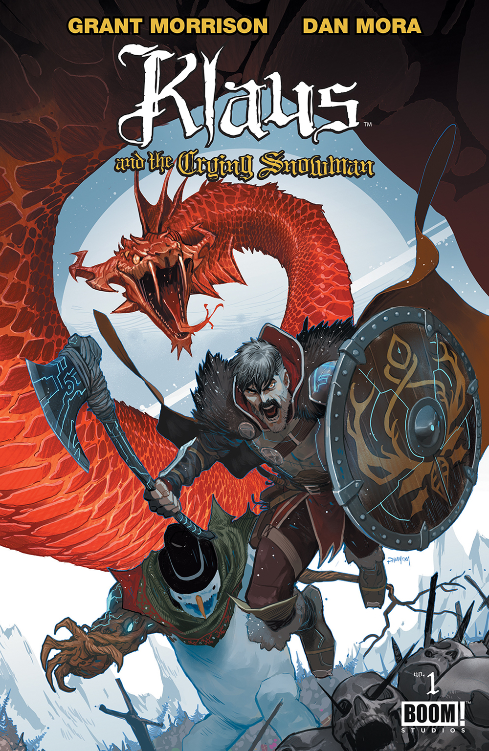
Comic of the Week: Klaus and the Crying Snowman #1 is another holiday gift from Morrison, Mora, Dukeshire

Klaus and the Crying Snowman #1 is our 12/19 comic of the week.

Klaus and the Crying Snowman #1 is our 12/19 comic of the week.

By d. emerson eddy -- Grant Morrison, Dan Mora, and Ed Dukeshire's Klaus began life as a mini-series in 2015, introducing a take on Santa Claus that was more evocative of old Germanic mythology as filtered through a kind of superhero meets fantasy lens. I'd almost say it's similar to what Marvel did originally when they reimagined Thor, but somewhat more magical and heartfelt. That series outlines his origin, humanity, and path to immortality as he fought for his friends and family to keep light and joy in the world. Since that original series, the creative team have been delivering a present of a new Klaus one-shot every year, (that can be enjoyed on their own without having read anything else), Klaus and the Crying Snowman now being the third.

Grant Morrison is probably best known for throwing big ideas, outlandish eccentric and hitherto unthought of propositions, out in his comics as if they were candy. His larger-than-life epics tend to get a lot of the spotlight, but personally I find when he's quiet, he's most compelling. When he mixes a childlike sense of wonder with heartfelt adversity and the human condition, I've found he's created his best works in All-Star Superman and Joe the Barbarian. That spirit is what typifies Klaus and again in Klaus and the Crying Snowman. There's the bombast and action of Klaus and Sam taking on the Tree-Clops and the terrors of Titan, to capture the imagination, or the idea of a number of Santa-themed heroes representing different cultures powered by belief, but the heart of the story is Sam's struggle. Of being a snowman created by a son who misses his father.

Bringing the magic to life is Dan Mora, who is criminally unheralded in the industry as of yet. His artwork is gorgeous, his layouts and designs phenomenal, and use of color amazing. He has a style that has hints of the Kuberts, some Stuart Immonen, Sean Murphy, and Russell Dauterman, even a little bit of Walt Simonson, but combines into a look all his own, both detailed and refined. The design for Sam the Snowman alone is wonderful, keeping a simple core body and traditional face, but adding a flair with his scarf and unique visual when it comes to his arms made from branches. And he draws the best wolves.

Ed Dukeshire rounds out the team, providing some great lettering work. The fonts and word balloons for Sam, the Yule-Goat, and Surtur all get a unique appearance, giving an appropriate feel to their voices. Sam's white on blue narration boxes are also a nice touch.

Overall, Klaus and the Crying Snowman captures what I feel is the spirit of the Yuletide. Not the crass commercialism of modern society, nor the overly religious trappings of an observing Christian Christmas, but a sense of wonder, a sense of family, and belonging. It appeals to the kid in all of us that just wants to be safe and warm, surrounded by joy and wonder. That's magic.

 Klaus and the Crying Snowman #1
Writer: Grant Morrison
Artist: Dan Mora
Letterer: Ed Dukeshire
Publisher: BOOM! Studios
Price: $7.99

Check out past Comic of the Week selections on the list page.

d. emerson eddy is a student and writer of things. He fell in love with comics during Moore, Bissette, & Totleben's run on Swamp Thing and it has been a torrid affair ever since. His madness typically manifests itself on twitter @93418.

Comic of the Week: Black Hammer Cthu-Louise, an Original Idea in a World of Homage

Black Hammer: Cthu-Louise is out now.

By d. emerson eddy — For a few years now Jeff Lemire and Dean Ormston, along with a host of other talented collaborators, have been building a universe at Dark Horse in Black Hammer, founded on a deep love for Silver Age comics, paying homage to many of the characters and characteristics of that era. The series began as a kind of mystery about the disappearance of a Justice League analogue, but quickly spiralled out into spin-off series, including a far-flung future with teen heroes and a focus on one of Black Hammer's arch-enemies and his legion of villains. It was in this spin-off, Sherlock Frankenstein & The Legion of Evil, that we first met Chtu-Lou, and his cute little daughter, Cthu-Louise.

While the homages to the Silver Age Justice League, Legion of Super-Heroes, Legion of Doom, Vertigo, and beyond are wonderful, reading through The Quantum Age #5 this week as well got me wondering if the Black Hammer universe would work as well without the pastiches and homages to DC Comics. For my money, yes. I actually find that the non-homage, original characters and story elements are even more impressive. Such is Black Hammer: Cthu-Louise, a one-shot from Jeff Lemire, Emi Lennox, Dave Stewart, and Todd Klein.

This story plays hard into one of Lemire's favorite themes, the importance of family, but it does so from a unique perspective. Louise doesn't have a loving family. Her father, Lou, was a super-villain, and now is just a lazy, abusive father taking out his frustration on his relatively innocent daughter, who is only looking for love and acceptance. Her mother is absent most of the time, working, but is equally emotionally abusive to Louise. When you add the problems she has at school due to her monstrous appearance, Cthu-Louise doesn't have an easy life. But she does have her “grandfather”, the elder god who granted her father his powers and thereby hers, and it's interesting how Lemire massages this into an “Eye of the Beholder”-type story.

Lemire's Plutona collaborator, Emi Lenox, handles the line art for this story and, combined with the greens and purples of Dave Stewart's colors, presents a fairly light-hearted, cartoon-like style. It works well for Louise's age, giving it a colorful, deceptively-simple appearance, covering the darkness beneath the surface.

On top of that, the lettering from the legendary Todd Klein adds overall to the feel of the story, giving us some unique fonts and word balloons for Cthu-Louise, Cthu-Lou, and her grandfather. It's particularly interesting the gradation of the word balloons that the style of Cthu-Louise and Cthu-Lou's is about halfway between the normal human balloons and that used by her grandfather. It's a subtle way of showing that Cthu-Louise is an intermediary between normal and the beyond.

Overall, this is an excellent comic that shows the possibilities of the Black Hammer world outside of the main narrative, that the universe itself has legs of its own, and that the characters within it can carry a story without necessarily working within the meta-narrative of Silver Age homage and nostalgia (even if Cthu-Louise herself is a twist on a Lovecraftian pastiche). Lemire, Lenox, Stewart, and Klein give us a story that stands on its own tentacles.

Black Hammer: Cthu-Louise
Writer:
Jeff Lemire
Artist: Emi Lenox
Colorist: Dave Stewart
Letters: Todd Klein
Publisher: Dark Horse
Price: $3.99

Check out past Comic of the Week selections on the list page.

d. emerson eddy is a student and writer of things. He fell in love with comics during Moore, Bissette, & Totleben's run on Swamp Thing and it has been a torrid affair ever since. His madness typically manifests itself on twitter @93418.

Comic of the Week: Wizard Beach #1 is an under-the-radar debut that deserves attention

Wizard Beach #1 is out 12/5.

By d. emerson eddy — This week has seen a fair number of incredible debuts, end-loading the year with some great reads like Die, The Freeze, and Self/Made from Image, Martian Manhunter and Shazam from DC Comics, and Killmonger and Winter Soldier from Marvel. Any one of those could be considered a phenomenal read this week, and you shouldn't be disappointed. From flights of fantasy to intrigue thriller, intellectual science fiction to lighthearted superhero family drama—these comics have you covered, and I can wholeheartedly recommend any of them. But there's one debut this week that may have flown under the radar and deserves your attention, Wizard Beach #1 from BOOM! Studios.

The main draw for me here is the line art from Conor Nolan. I first noticed his art earlier this year when he was working on Bedtime Games from Dark Horse (with Nick Keller, Kelly Fitzpatrick, and John J. Hill), and the artwork just captivated me. Nolan has a style that looks highly influenced by artists like Bernie Wrightson and early Sam Kieth, with maybe a little Eric Powell, presenting highly detailed, but highly exaggerated artwork that works incredibly well for horror, but now also here for humorous fantasy. Nolan's work tends towards a more refined, almost cartoon-like approach for this story, with a fairly clean fresh-faced design for our main protagonist, Hexley Ragbottom, amidst the scruffier cast of characters.

Joining Nolan to tell the tale is Shaun Simon (previously of Art Ops and True Lives of the Fabulous Killjoys) and what we get here is a very unique take on wizarding and a world of magic. Often times in these sorts of things, we'll have an upstart young wizard looking to upend the rules and forge his or her own way, but not so here. Instead we get the reverse. Hexley wants to see a return to the days of old when wizards were powerful and respectable, in part to halt the end of the world and the decline of magic, and also out of what feels like responsibility to his heritage. When his father refuses to help, he searches out his uncle, Salazar, who, much to Hexley's dismay, is a beach bum. It's a very funny reversal of roles and leads to some rather unique predicaments even in this first issue.

Rounding out the creative team are Meg Casey's wonderful colors, presenting an amazing darkness in the opening battles between wizards and monsters, then changing to the brighter atmosphere of the wizard beach itself. And Mike Fiorentino embellishing upon the designs on the page with a nice flair for some of the chapter headings and newspaper articles, giving even the lettering a feel of blending the natures of both a magical and a mundane world.

Overall, this isn't the type of story you'd necessarily expect. It's at turns humorous and irreverent, and plays with some entrenched fantasy themes, turning them on their ear. Simon, Nolan, Casey, and Fiorentino have the beginning to something different here, something different and also something highly entertaining.

Wizard Beach #1 (of 5)
Writer:
Shaun Simon
Artist: Conor Nolan
Colorist: Meg Casey
Letterer: Mike Fiorentino
Publisher: BOOM! Studios
Price: $3.99

d. emerson eddy is a student and writer of things. He fell in love with comics during Moore, Bissette, & Totleben's run on Swamp Thing and it has been a torrid affair ever since. His madness typically manifests itself on twitter @93418.

Comic of the Week: Marvel 2-in-One #12

Marvel 2-in-One concludes this week, and what a wonderful ride it has been.

By d. emerson eddy — All good things come to an end. That's the reason why The Simpsons is currently in season 30 while Futurama was allowed to go into that good night twice. For the past year or so, Chip Zdarsky has been writing one of the best Fantastic Four series not to be called by that title, aided by artists like Jim Cheung, Valerio Schiti, Declan Shalvey, and finally for the latter half of the series' run Ramón Pérez. Marvel 2-In-One represented the heart and soul of the Fantastic Four team as Ben and Johnny travelled the multiverse to find their missing family. In many ways, the heart was broken and the soul was crushed as Johnny found that Ben had been lying to him about the rest of them being alive, and later the broader sense of Reed and Sue lying to them both.

This has been a good year for Chip Zdarsky Marvel tales, with him proving repeatedly on Peter Parker: The Spectacular Spider-Man and Marvel 2-In-One that he could deliver highly emotional, introspective character pieces. He could guide us into the heads of some of our favourite heroes and let us know how they tick. He does so here again with this series finale, letting us in on the raging tempest inside Johnny Storm, as he and his sister hash it out. First through retail therapy, then a confrontation with the Mole Man and Rachna Koul tying up a couple loose ends from earlier in the series. It's only been in this title where the larger complications of Reed, Sue, and the kids being off on their adventure have been addressed in any sort of meaningful, mature manner, and it has been magnificently accomplished.

It took me some time to come around to Ramón Pérez's slightly different style on this series than his previous thinner and cleaner lines on titles like Nova, but the style here grew on me. The darker, heavier lines worked well on the beaten-down world run by a villainous Spider-Man, continuing to give weight to the emotional situations between Reed & Ben last issue and Sue & Johnny this issue. With Federico Blee's colours, there's a certain bleak feel to the art that works incredibly well for the frustration and disappointment that feels for what amounts to a betrayal from the rest of his family.

Overall, this has been a thought-provoking, heart-wrenching ride, dealing with what it means to be a member of this fantastical family and what happens when there are impediments in the way for that family to function to its fullest. Chip Zdarsky has handled the hard questions and messy emotions of having your family let you down here, but he reminds us at the end that they're still a family, and that families are at their best when they stick together.

Marvel 2-In-One #12
Writer:
Chip Zdarsky
Artist: Ramón Pérez
Colourist: Federico Blee
Letters: VC's Joe Caramagna
Publisher: Marvel Comics
Price: $3.99

Check out previous Comic of the Week selections.

d. emerson eddy is a student and writer of things. He fell in love with comics during Moore, Bissette, & Totleben's run on Swamp Thing and it has been a torrid affair ever since. His madness typically manifests itself on twitter @93418.

Comic of the Week: Go-Bots #1 is a great example of nostalgia done well

Go-Bots #1 is the Comic of the Week for 11/21.

By d. emerson eddy — Nostalgia sells. Memories of your youth, precious moments from your childhood. Especially among geeks. It's one of the reasons why you see so many reboots and remakes of favorite childhood properties like Transformers, She-Ra, and Ghostbusters. It's also often a cynical move on the part of intellectual property holders in order to play a safe bet, but that's a different argument for a different time. Right now, it's about nostalgia.

This week, IDW's Transformers mainline continuity came to an end with Optimus Prime #25. While it grew out of a nostalgia for Marvel Comics' Transformers title, especially with Simon Furman writing, it soared off on its own path, creating a brave new continuity. Although Optimus Prime was an end, IDW also launched a new beginning featuring other robots in disguise, this week’s Go-Bots #1.

The Go-Bots were like the Transformers, technically predating them, featuring robots that transformed into vehicles the same way, along with some that became rocks. Yes, robots that turned into rocks. I had a few of both the regular Go-Bots when I was a kid, as well as a couple Rock Lords, so you could kind of say that this new comics series is aimed at people like me and my feelings of nostalgia.

In more recent years, the Go-Bots became part of the Transformers franchise in various forms. Most in a type of mini-car vehicles utilizing the names but not their original designs, this series from writer/artist Tom Scioli takes us back to the originals.

Scioli is probably best known for his Kirby-esque art on Godland with Joe Casey, but he’s also garnered attention for the ‘80s cartoon inspired Transformers vs. GI Joe for IDW that featured a style similar to this. He gives this series an incredible attention to detail, making this feel like a dated product, from the art style to color reproduction, the faded yellows and browns making the pages feel old, and the little bits and pieces of ‘80s pop culture references that might not even be noticed if you weren't already familiar with them. It's a fun trip down memory lane.

Yet, beyond that, Scioli still makes this a highly entertaining story. If it were just nostalgia, it would likely be fairly empty, but there's a depth to the storytelling that works independently. He introduces us to the major players like Leader-1 working for the military, Turbo and Cy-Kill in the racing and illegal robot combat arena scenes, and every day bots like Scooter who are just fulfilling their function for their doting human companions. Scioli presents a dense tale of a world made better by the Go-Bots, and, in this first issue, a hint of what might happen should their morality chips malfunction.

Overall, this is a fun comic with great art that revels in some of the ridiculousness of the source material (the clever names like Cy-Kill or the new character T. Coriander Banks) while still being enjoyable and comprehensible for new readers.

Go-Bots #1
Writer, Artist, & Letterer:
Tom Scioli
Publisher: IDW
Price: $3.99

d. emerson eddy is a student and writer of things. He fell in love with comics during Moore, Bissette, & Totleben's run on Swamp Thing and it has been a torrid affair ever since. His madness typically manifests itself on twitter @93418.