TRADE RATING: Sara by Garth Ennis and Steve Epting is great start for TKO Studios

Garth Ennis Sara, with art by Steve Epting, is available now via TKO Studios.

By Jarred Luján — TKO Studios recently rolled out their debut line-up, which was essentially headlined by Sara, a story about an all-female Soviet sniper unit fighting against the Nazi invasion of their country. I snatched Sara up pretty quickly because of my familiarity with both the writer and artist. Garth Ennis wrote one of my favorite books of all time, Punisher: Born, Steve Epting drew one of my favorite Captain America stories back in the day, collaborating on it with Ed Brubaker.

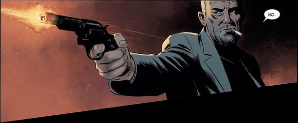
Before I dive deeper into the story here, I want to make something clear: the art in Sara is absolutely brilliant. While this book, of course, has its fair share of shootouts and battles and explosions, some of my favorite moments involve Epting’s artwork showing the small expression changes on characters’ faces. Ennis’ script did a fantastic job building up these characters, but it’s Epting’s art that really emphasizes character moments in a way that creates a more engaging reading experience. For those of us who have read comic illustrated by Epting in the past, this comes as little surprise.

Snowy Soviet plains probably do not sound like the best backdrop for a colorist to flex their talents, but Elizabeth Breitweiser does so here. Again, I’m talking mostly about small things, like the rosy cheeks in the midst of the brutal cold. Each moment a sniper bullet tears through a Nazi, the colors create a beautiful contrast of red mist and snow. So many of these pages are littered with black and white tones, yet they still convey much depth in various areas.

So, going into the story itself, it’s probably relevant to note that I have personally lived my entire life surrounded by soldiers. On my mother’s side, I am literally the only male that didn’t enlist (I doubt I’ll ever hear the end of that one, btw.) My family being the way it is meant I grew up with a mixture of war being mythologized and lessons on the darkest aspects of armed conflict from people who had firsthand experience. Growing up, I’d often sit around and watch war movies with my grandfather, or exchange war books with my step-grandfather, who both regularly shared personal anecdote from their times in Korea or Vietnam…sometimes these were funny stories or tales of heroes, and sometimes they were downright terrifying.

This is all a means of noting that war stories tend to draw me in more than they might the average person. Generally, there are two common ways that war stories are told. The first is your basic Good Versus Evil. It’ll usually feature the sacrifice of Good Heroes, who are certain their side is right and just, with a tinge of patriotism painted underneath. The second is about What War Takes Away. These stories feature good people doing evil deeds, corrupted by the nature of warfare. This often means a loss of decency, hope, morality, life, and—almost always—innocence.

That first type of story is typically the most common way that we see depictions of World War II. There are few human conflicts where it’s so clear where each side stands, what each side represents. Sometimes these stories gloss over the wrongdoings of the side they represent, in an effort to represent them well.

With Sara, Ennis has no interest in doing that. Sara, for whom the story is named, is an extremely conflicted character. She kills Nazis, sure, even efficiently, but Sara time and time again reflects on the cruelty of her own nation, the one she’s defending. This theme lends to some of the best character moments in the book, people clinging to the ideal outcomes of this war, and a jaded Sara trying to figure out where she stands in the first place.

This second type of grey morality story is how the greatest war stories are told. Ennis, though, has a reputation for flipping war stories, for creating a third option all his own. That ability is what made his work on Punisher: Born so brilliant: Ennis concocted a story of Frank Castle seemingly losing something, but it isn’t until the final pages that readers learn he has instead brought something back with him. It isn’t loss, it’s converting.

Ennis does more subversion of expectations in Sara. Sara’s comrades are the vehicle for this, rather than the dark captioning system that he used to accomplish it within the narrative of Punisher: Born. The parts of the story set in the past here also help us understand what’s happened to Sara to make her feel so ambivalent about the nation she finds herself serving. We discover that it wasn’t the loss of any one thing for Sara, but rather a gaining of truth. A truth that Sara’s devoted friends are not prepared for.

Sara is a slow burn of a book. The first couple chapters really focus on building the situation around Sara and her team, but ultimately that slow burn becomes an explosive flourish. The ending of this story fires on all cylinders, with Ennis teaching a master class on pacing. Sara, in the end, is a comic that incorporates many aspects of the real war stories my family has shared with me throughout my lifetime. Stories about that include patriotism, heroes, and glory, as well as terror, uncertainty, and doubt. Sara is a rarity in that it blends all of those things organically into a single powerful tale.

Overall, TKO has picked a worthy story from a seasoned creative team to represent the publisher well at its launch.

Sara #1
Writer:
Garth Ennis
Artist: Steve Epting
Colorist: Elizabeth Breitweiser
Letterer: Rob Steen
Publisher: TKO Studios
Price: Digital $13.99, Paperback $17.99, Individual Issues in Collector’s Box $24.99
Get It: Via TKO Studios

Check out more of our thoughts about trade paperback and original graphic novel on our reviews page.

Jarred A. Luján makes comics, studies existential philosophy, and listens to hip-hop too loudly. For bad jokes and dog pictures, you can follow him on Twitter.


Comics Anatomy: Velvet's perfect page

By Harry Kassen — Hello Bookcase readers, I’m Harry Kassen and this is the inaugural Comics Anatomy, a bimonthly look at comics craft and technique. Each installment will center on a particular comic’s use of various elements of comics craft. Most articles will focus on a particular element of a book, but for this first article I thought I’d give a sense of the sorts of topics I’ll be dealing with by explaining the many different things at play in a page of one of my favorite comics: Velvet by Ed Brubaker and Steve Epting.

This is page five of Velvet #3, and it’s one of the best comics pages I’ve ever seen.

Before delving into specific things, let me say that all of the creators on this book are at the top of their games here. Brubaker does a great job crafting a well-paced, intricate spy thriller. Epting’s moody art and clear storytelling make sure that nothing is missed but also create a strong sense of atmosphere and setting. Elizabeth Breitweiser (though I disapprove quite strongly of her association with CG) does a characteristic great job of supporting the moodiness of Epting’s inks. Lastly, Chris Eliopoulos tops all of this off, tying together the various elements with slick, readable lettering. Many comics meet these criteria, though, so why am I writing about this one?

Looking at this page in particular, the real strengths of this book are apparent. This page is eminently readable with the reading order popping off the page. Much of this is due to Eliopoulos’ work in placing the balloons so that they draw your eye to the next image. Taken alone, however, the page still isn’t totally clear. When the lettering is looked at along with the art though, the reading order is unmistakable.

The lettering carries the reading order through the top tier of the page and into the second, but the reading order for the middle tier into and through the bottom tier is dictated by the art.

This makes sense. The storytelling in the top tier of the page leading into the middle tier is mostly done in dialogue. It’s just our two main characters, Velvet and Burke, talking with two thugs. There isn’t much character movement or action until the middle tier. Starting in this panel, though, the action takes over (more on this later) and the storytelling and communication of reading order is all done through the art. Epting shows characters, specifically Burke, moving and doing things with minimal dialogue.

More than just transitioning from dialogue-forward to action-forward storytelling, this panel does something very impressive that requires all elements of the page to work in concert: It gets you to read backwards.

Velvet's Perfect Page Image 5.jpg

What I mean by this is that western readers like me are trained to read from left to right. Even in visual media like comics, we tend to see narrative progress in left-right movement and find reading in reverse to be unnatural. That’s the beauty of this panel. Everything in it works together to pull your eye from right to left across the image.

There’s a lot to look at here, so I’m going to do this in the order you would see it when reading. The first thing you’d see is the transition from panel 3 into panel 4. It’s essential that the reader goes straight from panel 3 into this one at the right side in order to get the full effect, and this is ensured in a few ways. The first and most obvious is that the lettering in the third panel is at the bottom of the panel and the lettering in the fourth is at the top, right below the third.

This takes your eye straight from “Just get on the ship and--” to “No.” without giving you any time to lose track of or question what comes next. The eye just drops down and catches on the balloon. This is highlighted by the fact that the entire upper-right corner of the panel is black, emphasizing the small white oval of the speech balloon. The art and the lettering work in concert here to guide your eye to the exact place it needs to go.

The next part of what makes this panel special is the real magic bit: how it gets you to read it right to left. The most obvious thing is that the gun is a big pull and the bright flash is enough to get your eye, but if that were the case you would jump immediately to the left and not spend time traveling across the panel. The image makes you spend time with it and engage in the process of moving across the page, giving you the feeling that it’s happening now, not that it’s already happened.

Velvet's Perfect Page Image 5.jpg

The art team know that wouldn’t make for interesting reading and take advantage of this opportunity to show you things in process rather than completed actions.

There are a few techniques at play here, all of them coming from Epting and Breitweiser. The first piece is the motion line. This book aims for a pretty realistic visual feel so it minimizes motion lines, sound effects and other, similar devices, but in this panel there’s a motion line from Burke’s jacket on the right to the outstretched arm on the left.

The fact that these are so infrequent makes this one instantly something to pay attention to. It also stands out from the rest of the panel visually because it’s a different color from what’s behind it as it begins and then again as it finishes. Epting/Breitweiser (I don’t know how much of this part each person did, inks for this book are hard to find since it was done digitally) make sure that the motion line is light against the dark cloth of Burke’s shirt and then it shows up again as lighter than the red background. This provides something to latch onto and pulls the eye across the page slowly because it’s still a slightly unnatural process. You almost feel at this point like you’re watching the gun move left. This one element, however, is not enough to cement the reading order.

Another part of this is that the background has been dropped out for this panel. That can have the effect of speeding up the panel but in this case it’s more important to look at what has replaced the background.

As I’ve already mentioned, the top right corner of this panel is black, but the rest of the panel is a red gradient that gets lighter as it goes from right to left. Given that you start in the black region on the right, the natural progression is to follow the gradient left as it gets lighter.

The last notable technique used in this panel is the non-rectangular panel shape. The top border and the two sides stay at right angles like a traditional rectangular panel but the bottom border slopes down as it moves from right to left, making the panel expand in the direction of the action.

This does two things. First, it makes the eye move from the confined right side of the panel over to the wider left side. This reinforces the reading order, getting you to look where you’re supposed to look. The other thing it does is lead the reader into the third tier by pulling the eye down along the panel border. Without that downward slope, neither of those things is as clear.

*This screen cap has been altered in Photoshop to demonstrate what the panel might look like without the downward-sloping border to guide the eye.

This takes us to the third tier, which may be my favorite part of the page. The third tier is made up of one panel showing a man who was just shot on the left, Burke in the middle pointing the gun right, and a man being shot to the right of that.

Velvet's Perfect Page Image 12.jpg

Thinking about it like that, it’s actually a pretty boring moment to draw. If we think of the panel as a frozen moment in time, the moment Epting chose is one that happens after all of the action is already done. Both men have been shot already and there’s nothing else happening. Epting is too good to let the panel be boring though. He sets this panel up to create an engaging, almost cinematic feel and it has everything to do with the way Burke is drawn. Burke is shown in heavy shadow with a solid black line running from the bottom of the panel up to the top. Beyond creating atmosphere, this serves to separate the left half of the panel from the right, essentially making it into two panels, separating the moments. When reading this panel you get to the top left part, see it as a panel where Burke shoots the guy on the left, then you move right, passing Burke’s shadow and see a panel of Burke shooting the guy on the right. The deep shadow separates these two moments so that you can experience them one after the other and see the action as it’s happening rather than all at once. Without that shadow, it’s a bland panel, effective but uninteresting. With it, it’s one of the best panels I’ve ever seen.

*This screen cap has been altered in Photoshop to demonstrate what the panel might look like without the shadow.

And, while that wraps up my breakdown of this page, I’d like to say that this is by no means the only example of good craft in Velvet. I said it before and I’ll say it again: every member of the team turned out career defining (or redefining) work for this book, but if I tried to talk about all of it I’d be here all day. All I can tell you is to read the comic. Thanks for reading Comics Anatomy, and I hope you join me for more analysis of comics craft and technique in two months time.

Velvet
Writer:
Ed Brubaker
Artist: Steve Epting
Colorist: Elizabeth Breitweiser
Letterer: Chris Eliopoulos
Publisher: Image Comics

Harry Kassen is a college student and avid comic book reader. When he’s not doing schoolwork or reading comics, he’s probably sleeping. Catch his thoughts on comics, food, and other things on Twitter @leekassen.

REVIEW: Sara #1 is a direct hit for exciting new publisher TKO Studios

Sara #1 is free at www.tkopresents.com (password: vipaccess).

By Bo Stewart — “Wait…wait…wait.” A call for patience is how brand-new publisher TKO Studios introduces us to its line of comics. Wait for the perfect shot and be sure not to miss. This is the opening to Sara #1, a story about an all-female Russian sniper squadron in WWII. It’s also a fitting one, however, for TKO Studios itself. Just like with comics, a publisher only has one shot at a first impression. TKO had to get this right and if the first issue of war-thriller Sara is any indication, it took full advantage of the opportunity. Like our spirited protagonists on the page, the publisher comes out firing in the real world.

Legendary creators Garth Ennis and Steve Epting are cleverly meta with this first issue, immediately establishing a theme of patience. When main protagonist, the titular Sara, has been tasked with assassinating a Nazi colonel without any clues as to when or where the target will arrive, patience is her only path forward. The result is a perfectly-paced issue rife with tension.  I wanted Sara to take the shot as soon as the colonel is in her sights, but the character knows better. This issue reads as a teaser to the larger story of the book, which is exactly what a good introduction should do.

Allow me also to briefly indulge my inner history nerd. I’ve always been fascinated by the Eastern Front of the European Theater. Something about Nazis fighting Soviets, and the implied clash of political philosophies, fascinates me, and the creators here pick this theater as the setting for their story. We Americans love to point to D-Day as the beginning of the end for the Third Reich, but the East is where the Nazis truly met their demise. This thread of the larger World War II tapestry doesn’t get nearly the amount of attention it deserves, especially not in American media.

All of this is to say that Sara is interested in telling us a story from a perspective we haven’t seen in an under-utilized setting. Following a group of female Soviet soldiers is a stroke of brilliance. We know that the Soviets were very progressive in their views towards women at that time, but we don’t have many fictional stories that explore this dynamic in a military setting.   

I could go on and on about how awesome the creative team is, but most readers already know these guys. We know a book with the names Garth Ennis and Steve Epting on the cover is going to be great. That’s part of the beauty of TKO’s launch. The publisher knows that fans trust these creators and, in turn, that the creators trust their readers. As a result, nothing is over explained and the exposition is mercifully brief. This comic challenges the audience to keep up. Here’s the real kicker–TKO releases the full book all at once, so the depth of the story can be explored without waiting months at a time for subsequent chapters.

Overall: Sara fires on all cylinders. This is a strong, confident debut from industry legends Ennis and Epting. New publisher TKO Studios has its first hit. 9.0/10

Sara #1
Writer:
Garth Ennis
Artist: Steve Epting
Colorist: Elizabeth Breitweiser
Letterer: Rob Steen
Publisher: TKO Studios
Price: Free via TKO Studios (password: vipaccess)

For more comic book reviews, check out our review archives.

Bo grinds for the man by day so he can create comics by night. He is the lesser half of the Stewart Brothers writing team and can be found on Twitter and Instagram @stewart_bros