Comics Anatomy: Shifting Contexts in House of X

In this anniversary installment of Comics Anatomy, features editor Harry Kassen digs into House of X and takes a look at the ways in which Jonathan Hickman and Pepe Larraz contextualize and recontextualize X-Men history and elements from their own series to create new stories and meanings.

Read More

Comics Anatomy: Art Styles in Batwoman

By Harry Kassen — When it comes to Batwoman, there is no creator more heavily associated with the character than J.H. Williams III. From drawing the “Elegy” story arc in Detective Comics, written by Greg Rucka, to co-writing, with W. Haden Blackman, the majority of the New 52 Batwoman series and providing a good portion of the art for that run as well, Williams’ take on the character is the one that comes to mind whenever I think of Kate Kane. Reading back through his run on the character, however, has shown me that, visually, there isn’t just one version of the character, or any character in the series. Williams shifts his style constantly to give information about the characters and the worlds they inhabit, a brilliant move by a brilliant artist.

Read More

Comics Anatomy: Atmospheric Lettering in Gotham Central

By Harry Kassen — Hello and welcome back to Comics Anatomy. For this installment, I thought I’d write about one of my all time favorite comics: Gotham Central. Gotham Central is much beloved by comics fans and is a truly amazing comic for a wide variety of reasons. Chief among these reasons is its sense of tone. Like any good crime story, Gotham Central is steeped in atmosphere. From the very beginning it tells you that it’s a story about police first, and Batman second.

Read More

Comics Anatomy: Pushing Boundaries in Captain Marvel #1

By Harry Kassen — Hello everyone and welcome back to Comics Anatomy. As you know, Captain Marvel is coming to the big screen today, so I thought it’d be fun to do a special Captain Marvel article going over some of the craft elements at play in January’s Captain Marvel #1, written by Kelly Thompson with art by Carmen Carnero, colors by Tamra Bonvillain, and letters by Clayton Cowles. While establishing a new status quo for Carol—then abruptly throwing that out—this issue also does some more subtle things with craft that enhance the reading experience. I’m going to talk about one of them here today.

What jumped out to me when I read it is the use of special panel borders to signify something about the action in that panel or in panels around it. A great example of this is in the fight scene at the beginning of the book. There is a two-page splash that shows Captain Marvel and Spider-Woman fighting a giant monster.

This spread can be looked at as four panels, the first panel with the thick black outline showing Carol, the large panel that spreads across the pages is the second, the third is the panel to the right with the double border that shows the monster crashing into the building, and the fourth is the one on the far right with the double border showing Carol floating in the air. The thing I want to address is the phenomenon of the double panel border, but this page is a little trickier to understand without first looking at some other examples, so let’s shelve it for now and look at a different one.

Let’s look next at the two page spread near the end of the book that shows Nuclear Man attacking the four Avengers in that scene.

Like the last one, this one can be broken into four panels, though the first two are the ones that matter for our purposes. The first panel is another with a double border, showing Captain America lifting Nuclear Man. The second is the larger panel that shows Nuclear Man attacking the Avengers and launching them across the page. The double border around the first panel serves as a signal that something big is going to shift from that panel to the next. On one side of the border Cap is picking up a defeated Nuclear man, but on the other side of the border Nuclear Man has turned the tables on the Avengers and has gained the upper hand.

On a later page in this same fight the double border pops up again. The page where the Avengers are attempting to follow Carol through Nuclear Man’s portal has three double border panels showing individual Avengers and a large panel showing them being thrown back from the portal.

In both of these examples, the double border serves as an indicator that something is about to change or that something inside the panel is different than in the rest of the page. In the Nuclear Man spread, the double border panel shows the Avengers as winning the fight, then immediately on the other side of that border, in the next panel, the Avengers are losing to Nuclear Man.

In addition, there’s a shift from a vertical, relatively confined panel to a widescreen and very expansive panel. There’s a clear difference between the two and the double border signals that that change is coming.

Likewise in the page with the Avengers and the portal, the border serves to mark a clear shift in action and format.

The three double bordered panels show the three Avengers moving toward the portal but the rest of the splash shows them being thrown back. On a technical level, the three Avengers panels are diagonal and show left-right movement, but the portal panel is vertical and shows right-left movement. Once again, the double border is what signals this shift.

Which brings us back to the first example.

On this page, there are two double bordered panels. In the main spread, there is a large monster getting punched in the face by Captain Marvel. In the first double bordered panel, this monster is crashing into a building in the background. Lastly, in the second double bordered panel, Carol is hovering over the defeated monster. As with before, each of these panels is a distinct moment of the fight. On the level of story, the punch is the beginning of this interaction, the monster crashing into the building is the middle, and then the monster laying defeated on the ground while Carol hovers over it is the end. Looking at the technique, we can see that the first panel shows Carol moving and the monster being moved by her. This panel is the full two page spread and is horizontal. The next panel, which is tilted slightly, shows the monster moving. Carol isn’t in it. Lastly, the final panel shows Carol and the monster, both still. This panel is larger than the last and tilted even more. The double border serves to signal these differences once again.

This goes to show that the creative team of a comic have control over all the elements of the page’s composition. What counts as the art and storytelling isn’t just limited to the contents of the panels but also the way they’re shaped and how they’re framed. The architecture of a comic is important for developing the book’s visual language and guiding how the reader experiences the story, and Captain Marvel #1 is a great example of how to use this power well.

Captain Marvel #1
Writer:
Kelly Thompson
Artist: Carmen Carnero
Colorist: Tamra Bonvillain
Letterer: Clayton Cowles
Publisher: Marvel Comics

Check out Comics Anatomy: Velvet’s Perfect Page!

Harry Kassen is a college student and avid comic book reader. When he’s not doing schoolwork or reading comics, he’s probably sleeping. Catch his thoughts on comics, food, and other things on Twitter @leekassen.

Comics Anatomy: Velvet's perfect page

By Harry Kassen — Hello Bookcase readers, I’m Harry Kassen and this is the inaugural Comics Anatomy, a bimonthly look at comics craft and technique. Each installment will center on a particular comic’s use of various elements of comics craft. Most articles will focus on a particular element of a book, but for this first article I thought I’d give a sense of the sorts of topics I’ll be dealing with by explaining the many different things at play in a page of one of my favorite comics: Velvet by Ed Brubaker and Steve Epting.

This is page five of Velvet #3, and it’s one of the best comics pages I’ve ever seen.

Before delving into specific things, let me say that all of the creators on this book are at the top of their games here. Brubaker does a great job crafting a well-paced, intricate spy thriller. Epting’s moody art and clear storytelling make sure that nothing is missed but also create a strong sense of atmosphere and setting. Elizabeth Breitweiser (though I disapprove quite strongly of her association with CG) does a characteristic great job of supporting the moodiness of Epting’s inks. Lastly, Chris Eliopoulos tops all of this off, tying together the various elements with slick, readable lettering. Many comics meet these criteria, though, so why am I writing about this one?

Looking at this page in particular, the real strengths of this book are apparent. This page is eminently readable with the reading order popping off the page. Much of this is due to Eliopoulos’ work in placing the balloons so that they draw your eye to the next image. Taken alone, however, the page still isn’t totally clear. When the lettering is looked at along with the art though, the reading order is unmistakable.

The lettering carries the reading order through the top tier of the page and into the second, but the reading order for the middle tier into and through the bottom tier is dictated by the art.

This makes sense. The storytelling in the top tier of the page leading into the middle tier is mostly done in dialogue. It’s just our two main characters, Velvet and Burke, talking with two thugs. There isn’t much character movement or action until the middle tier. Starting in this panel, though, the action takes over (more on this later) and the storytelling and communication of reading order is all done through the art. Epting shows characters, specifically Burke, moving and doing things with minimal dialogue.

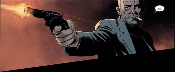
More than just transitioning from dialogue-forward to action-forward storytelling, this panel does something very impressive that requires all elements of the page to work in concert: It gets you to read backwards.

Velvet's Perfect Page Image 5.jpg

What I mean by this is that western readers like me are trained to read from left to right. Even in visual media like comics, we tend to see narrative progress in left-right movement and find reading in reverse to be unnatural. That’s the beauty of this panel. Everything in it works together to pull your eye from right to left across the image.

There’s a lot to look at here, so I’m going to do this in the order you would see it when reading. The first thing you’d see is the transition from panel 3 into panel 4. It’s essential that the reader goes straight from panel 3 into this one at the right side in order to get the full effect, and this is ensured in a few ways. The first and most obvious is that the lettering in the third panel is at the bottom of the panel and the lettering in the fourth is at the top, right below the third.

This takes your eye straight from “Just get on the ship and--” to “No.” without giving you any time to lose track of or question what comes next. The eye just drops down and catches on the balloon. This is highlighted by the fact that the entire upper-right corner of the panel is black, emphasizing the small white oval of the speech balloon. The art and the lettering work in concert here to guide your eye to the exact place it needs to go.

The next part of what makes this panel special is the real magic bit: how it gets you to read it right to left. The most obvious thing is that the gun is a big pull and the bright flash is enough to get your eye, but if that were the case you would jump immediately to the left and not spend time traveling across the panel. The image makes you spend time with it and engage in the process of moving across the page, giving you the feeling that it’s happening now, not that it’s already happened.

Velvet's Perfect Page Image 5.jpg

The art team know that wouldn’t make for interesting reading and take advantage of this opportunity to show you things in process rather than completed actions.

There are a few techniques at play here, all of them coming from Epting and Breitweiser. The first piece is the motion line. This book aims for a pretty realistic visual feel so it minimizes motion lines, sound effects and other, similar devices, but in this panel there’s a motion line from Burke’s jacket on the right to the outstretched arm on the left.

The fact that these are so infrequent makes this one instantly something to pay attention to. It also stands out from the rest of the panel visually because it’s a different color from what’s behind it as it begins and then again as it finishes. Epting/Breitweiser (I don’t know how much of this part each person did, inks for this book are hard to find since it was done digitally) make sure that the motion line is light against the dark cloth of Burke’s shirt and then it shows up again as lighter than the red background. This provides something to latch onto and pulls the eye across the page slowly because it’s still a slightly unnatural process. You almost feel at this point like you’re watching the gun move left. This one element, however, is not enough to cement the reading order.

Another part of this is that the background has been dropped out for this panel. That can have the effect of speeding up the panel but in this case it’s more important to look at what has replaced the background.

As I’ve already mentioned, the top right corner of this panel is black, but the rest of the panel is a red gradient that gets lighter as it goes from right to left. Given that you start in the black region on the right, the natural progression is to follow the gradient left as it gets lighter.

The last notable technique used in this panel is the non-rectangular panel shape. The top border and the two sides stay at right angles like a traditional rectangular panel but the bottom border slopes down as it moves from right to left, making the panel expand in the direction of the action.

This does two things. First, it makes the eye move from the confined right side of the panel over to the wider left side. This reinforces the reading order, getting you to look where you’re supposed to look. The other thing it does is lead the reader into the third tier by pulling the eye down along the panel border. Without that downward slope, neither of those things is as clear.

*This screen cap has been altered in Photoshop to demonstrate what the panel might look like without the downward-sloping border to guide the eye.

This takes us to the third tier, which may be my favorite part of the page. The third tier is made up of one panel showing a man who was just shot on the left, Burke in the middle pointing the gun right, and a man being shot to the right of that.

Velvet's Perfect Page Image 12.jpg

Thinking about it like that, it’s actually a pretty boring moment to draw. If we think of the panel as a frozen moment in time, the moment Epting chose is one that happens after all of the action is already done. Both men have been shot already and there’s nothing else happening. Epting is too good to let the panel be boring though. He sets this panel up to create an engaging, almost cinematic feel and it has everything to do with the way Burke is drawn. Burke is shown in heavy shadow with a solid black line running from the bottom of the panel up to the top. Beyond creating atmosphere, this serves to separate the left half of the panel from the right, essentially making it into two panels, separating the moments. When reading this panel you get to the top left part, see it as a panel where Burke shoots the guy on the left, then you move right, passing Burke’s shadow and see a panel of Burke shooting the guy on the right. The deep shadow separates these two moments so that you can experience them one after the other and see the action as it’s happening rather than all at once. Without that shadow, it’s a bland panel, effective but uninteresting. With it, it’s one of the best panels I’ve ever seen.

*This screen cap has been altered in Photoshop to demonstrate what the panel might look like without the shadow.

And, while that wraps up my breakdown of this page, I’d like to say that this is by no means the only example of good craft in Velvet. I said it before and I’ll say it again: every member of the team turned out career defining (or redefining) work for this book, but if I tried to talk about all of it I’d be here all day. All I can tell you is to read the comic. Thanks for reading Comics Anatomy, and I hope you join me for more analysis of comics craft and technique in two months time.

Velvet
Writer:
Ed Brubaker
Artist: Steve Epting
Colorist: Elizabeth Breitweiser
Letterer: Chris Eliopoulos
Publisher: Image Comics

Harry Kassen is a college student and avid comic book reader. When he’s not doing schoolwork or reading comics, he’s probably sleeping. Catch his thoughts on comics, food, and other things on Twitter @leekassen.