April 2018 Indie Comics Grab Bag: Storytelling Tools
I recently listened to a podcast* featuring a conversation between Vault Comics Editor-in-chief Adrian Wassel and writer Michael Moreci, during which Wassel articulated several elusive points that have been on my mind after reading Scott McCloud and Will Eisner's books on comics.
Wassel believes we are in a cinematic age of comics, a time of big splashy panels and super quick reads that rely on visual action more than denisty, nuance, or complexity. This, Wassel also believes, has been a good thing, a way for a young medium (comics) to learn some new tools, but he also couldn’t help but wonder if there was progress to be made by utilizing a wider variety of techniques as well, such as more co-mingling of prose with those big panels.
Coincidentally, our featured indie books this month seem to hint at those multimodule possibilities that Wassel wondered about. Admittedly, I likely wouldn’t have drawn a connection if not for the podcast, but I'd still like to use that idea as a through-line here.
So, let's get on to it…
*That podcast, I believe, is exclusively available via signing up for Moreci’s newsletter here.
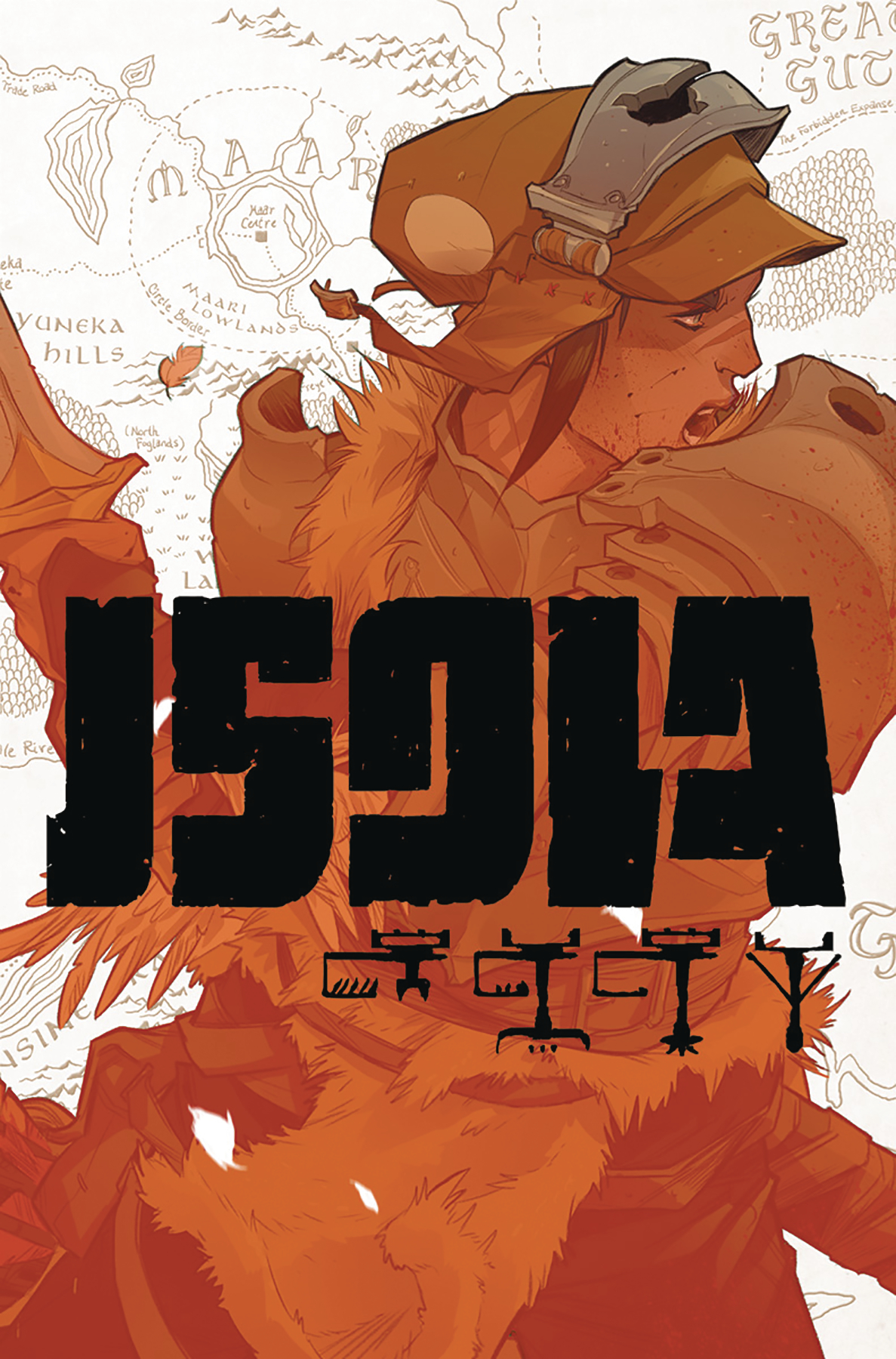
Isola #1 by Brandon Fletcher, Karl Kerschl, & Msassyk
Isola, make no mistake, is a beautifully-drawn comic book. Karl Kerschl’s line work is clean as it gets, and the tonal vibrancy of Msassyk’s colors make for an aesthetic akin to high-end animation. It's a prime example of the cinematic-style cited by Moreci and Wassel. See, Isola's story is a simple one: a protagonist leads a monarch tiger to a paradisaical place called Isola, and along the way there are tests, challenges, visions, hijinx.
Simply put, Isola takes little time to philosophize, or even to do much world-building. It’s an interesting choice for a fantasy comic, and I think we won’t entirely know if it pays off until we read future issues. The clues we get to a larger world come from clothes (high fantasy with perhaps a light touch of feudal Japan) and equipment (purely low-tech).
In these ways, Isola reminded me of the intro portion of an old-school RPG, wherein the player gets a feel for whether there’s magic, what kind of tech exists, and how the turn-based combat works, knowing that this portion will seem quaint later once the game opens up onto a sprawling world map. I hope a similarly larger scope is where Isola is headed.
Overall: Isola is a playground for artists Karl Kerschl and Msassyk, one that deftly introduces its protagonist, her goals, and the challenges she faces.
The Season of the Snake #1 by Josh Vann, Simone D'Armini, & Adrian Bloch
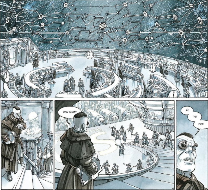
The Season of the Snake is one of the densest comics I’ve ever read, both in terms of its hyper-detailed artwork and its breadth of ideas. In many ways, it takes the exact opposite storytelling tact of Isola, bearing much more of a similarity to a novel than to a movie.
Whereas Isola was content to wow and captivate readers with its visuals, Season of the Snake is novelestic in scope, stimulating more with questions it raises about nation states, evolution, diplomacy, and reverence than with artwork. That’s not to say Simone D’Armini’s artwork is bad here. No, it’s quite good, and it deftly compliments the dense script.
There is just so much to unpack in this 68-page, three-part series debut. I enjoyed the depth of thought behind this book, as well as some of the visual touches the creative team used to show rather than tell (high praise in college creative writing workshops), specifically a mysterious flier that poetically reads “True life is the thing that s-s-seeps,” which did great narrative work to foreshadow coming plot points. The use of Adrian Bloch’s vivid colors during the story’s grandest set pieces is also interesting, heightening the sense of reality and consequence at those times.
Overall: The Season of the Snake seems destined to develop a rabid cult following of hard sci-fans who kept bugs or lizards growing up. It starts slow but has a lot to offer those who invest in it.
Coronary #1 - #2 by Ryan Burke, Joel Saavedra, & Damian Penalba
Coronary (which has a week left on its Kickstarter, btw) sort of straddles the techniques of the two previous books on this list. It’s rich with quick panels, a la Isola, especially early in the first issue, where Ryan Burke’s script moves through the quietude of Joel Saavedra's artwork, expertly conveying feelings of pensiveness, yearning, and loneliness. Burke also has an ear for dialogue that he deploys well, and his use of a fictional magazine Q&A and a psychologist's scribbled notes at the end of the issues disperse additional exposition that brings our plot into focus.
What I found most intriguing about Coronary, though, was its use of transitions and juxtapositions. Going back to the idea we cribbed from Wassel about creators tapping more tools, Coronary takes advantage of the way that comics’ inherent sequential structuring forces readers to make their own connections in order to understand a story progresses. See below:
Notice the juxtaposition. These panels appear as a character begins to zone out on a train. While your own interpretation may vary, I understand them to mean that sex to him is as routine as reaching for an umbrella, that he objectifies and uses women as he might a tool to keep dry in the rain. It would take pages in a novel to convey this effectively, but Burke and Saavedra do it with the subtlety of four panels and ⅔ of a page. That's just one example; this book is rich with more.
Overall: I really liked both issues of Coronary, so much that after reading them (and writing this) I helped with this Kickstarter. I urge you to do the same.
Zack Quaintance is a career journalist who also writes fiction and makes comics. Find him on Twitter at @zackquaintance. He lives in Sacramento, California.


